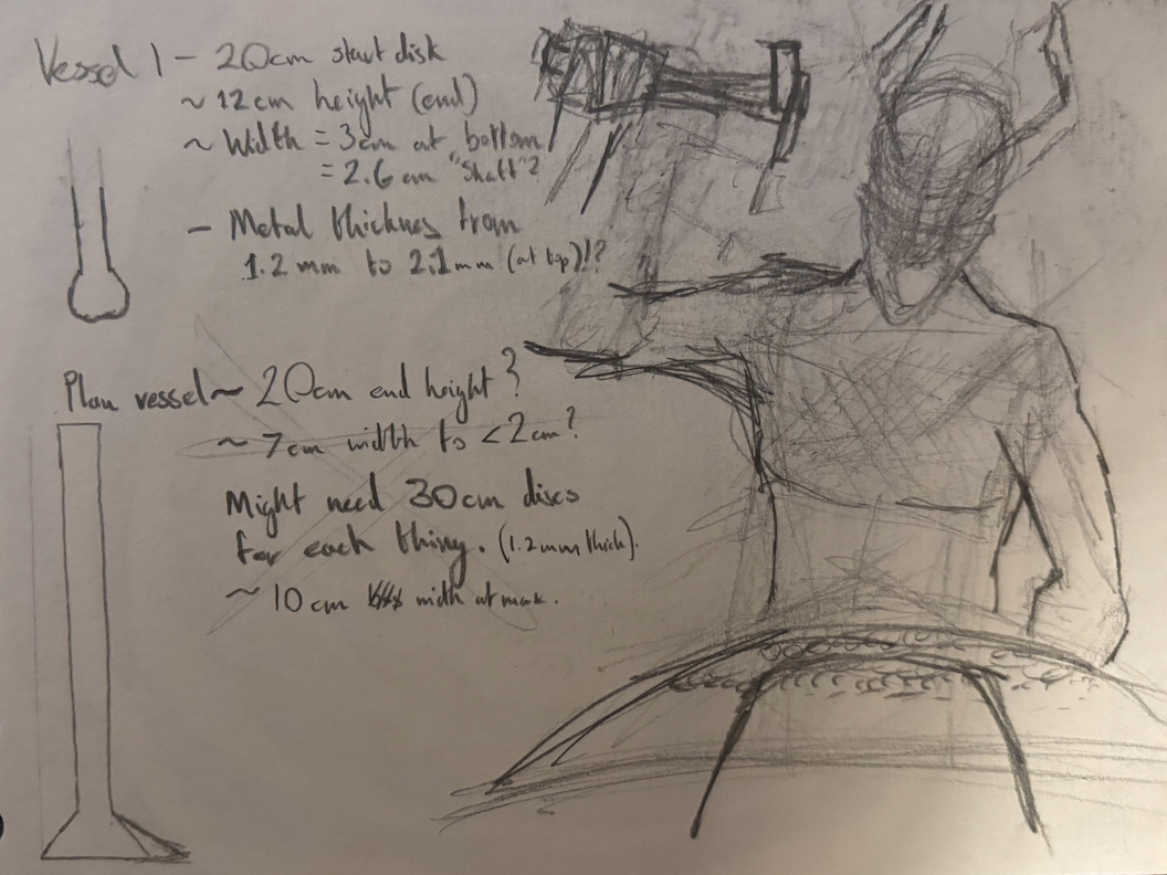
The first thing of the term; before sketching out ideas, I started raising. Easing back into it I wanted to understand the metal more.
I started out with one standard circle and rectangle.
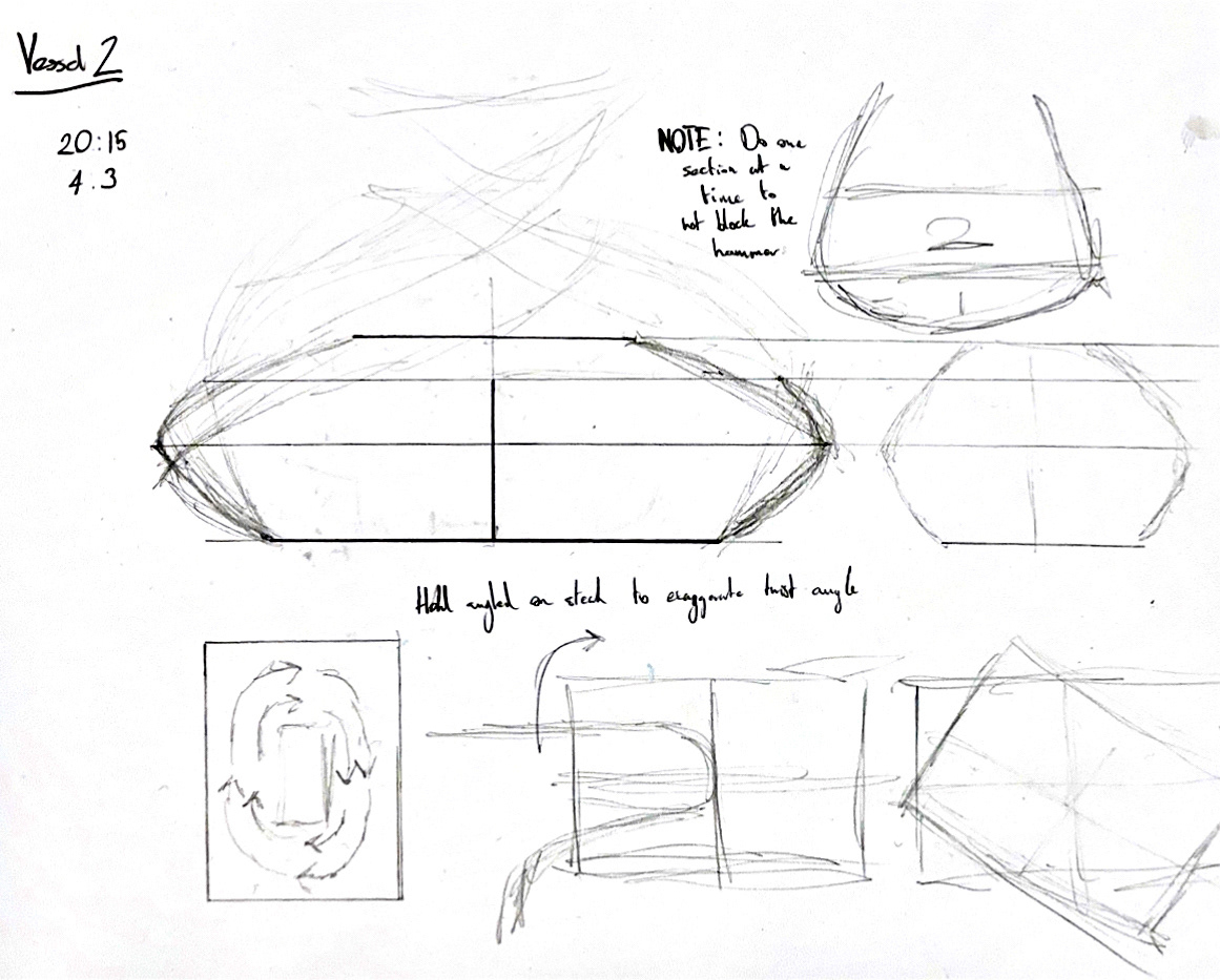
This sample vessel was a means to visualise the way I can manipulate the metal sideways as well as raising it upwards. the plan was to raise it inwards more too. However, in hindsight, I should've raised and planished in smaller sections as it became unviable to planish past a certain point.
Knowing that I can exaggerate the twist in the sheet, I can possibly use new finish and surface details in the future.
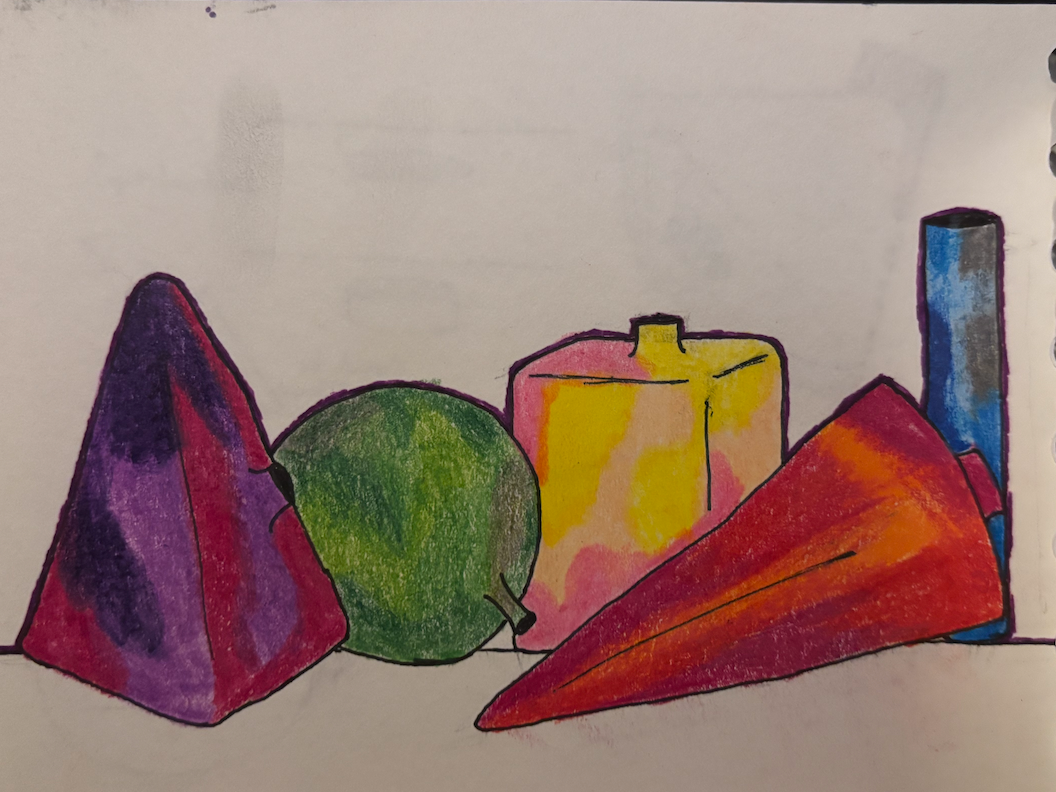
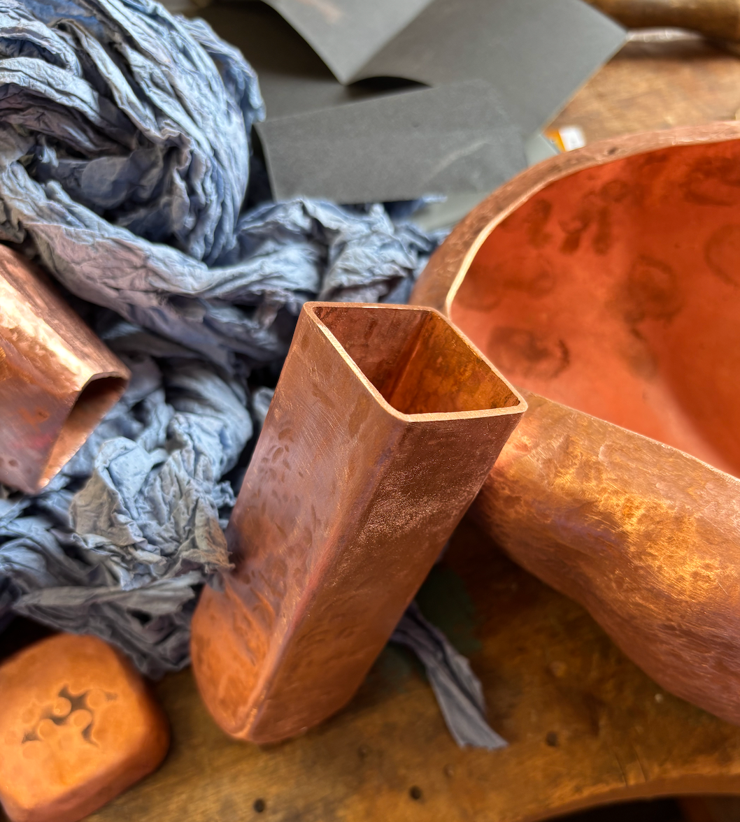
Continuing the copper manipulation:
This sample was originally meant to display how thin I can get the metal. I was meant to produce a sample of a wavy vessel as seen in the sketch, but due to time constraints I moved on early and used it as a finish sample.
This was all to inform my strategy for the way I'll raise the final pieces.
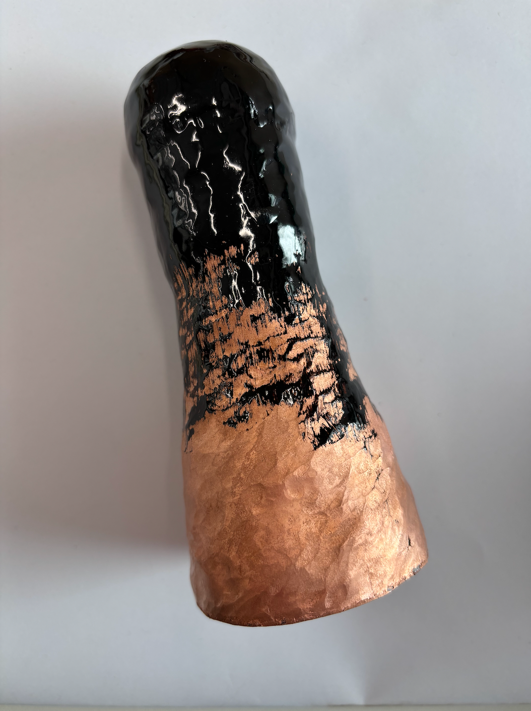
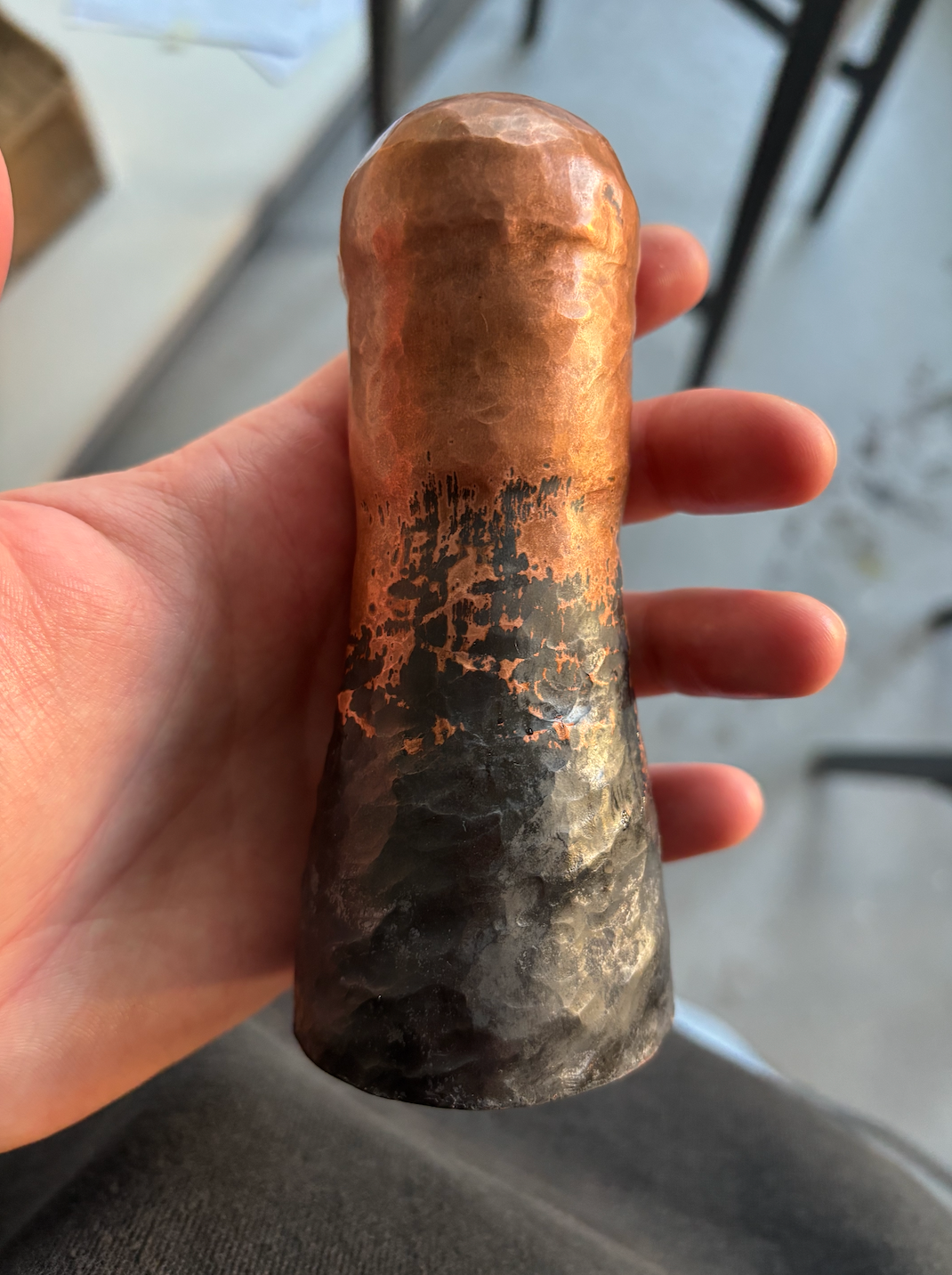
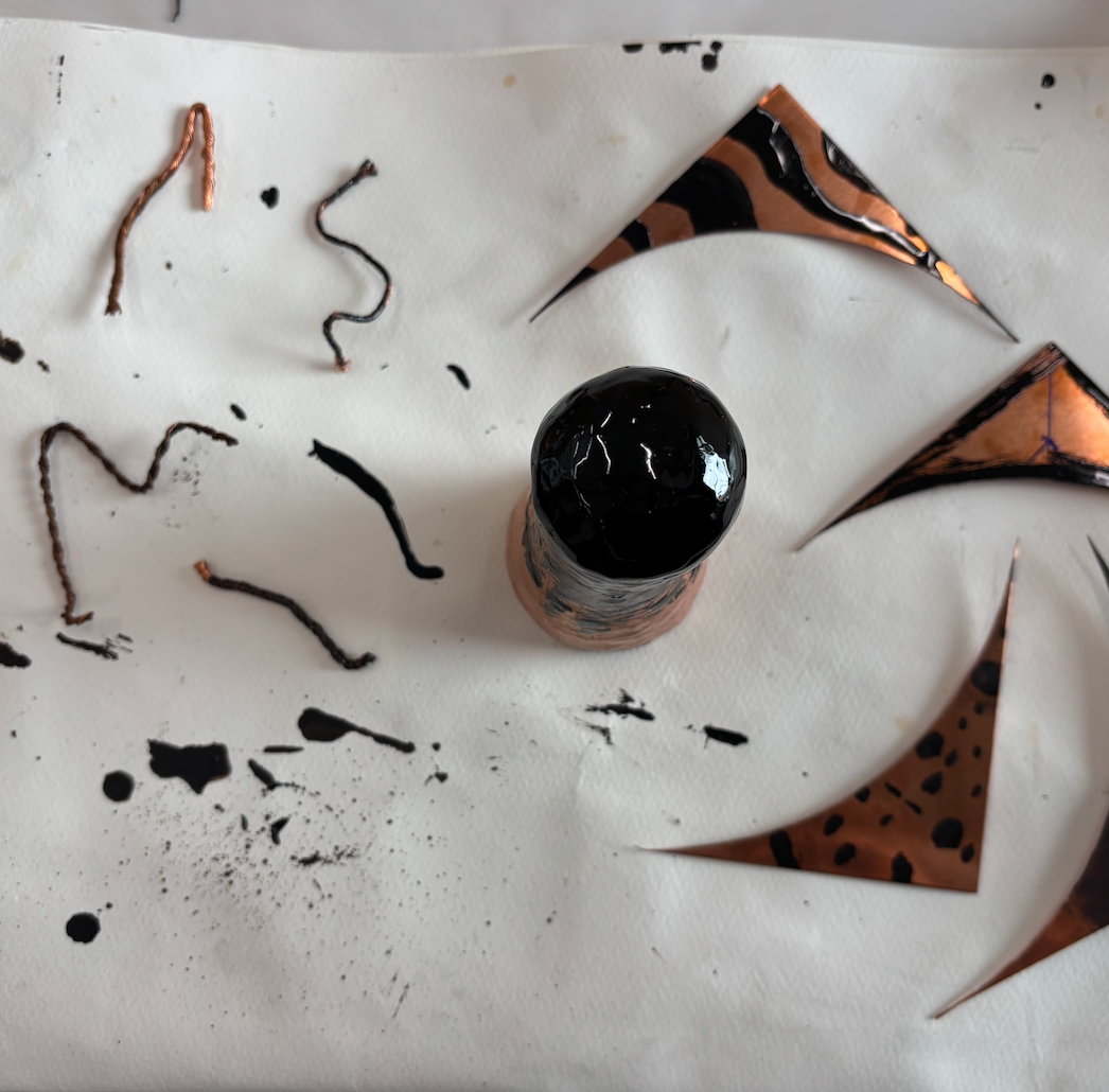
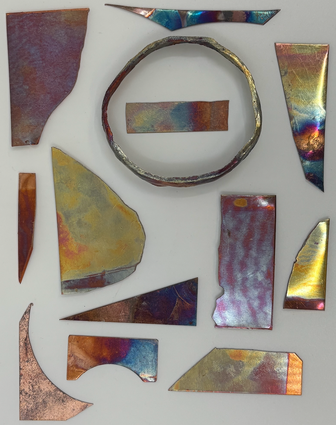
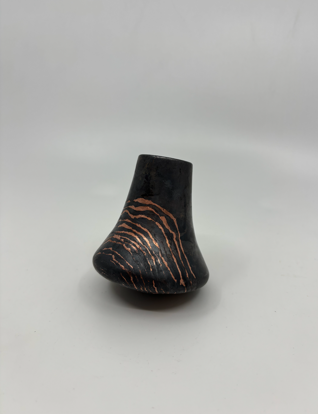
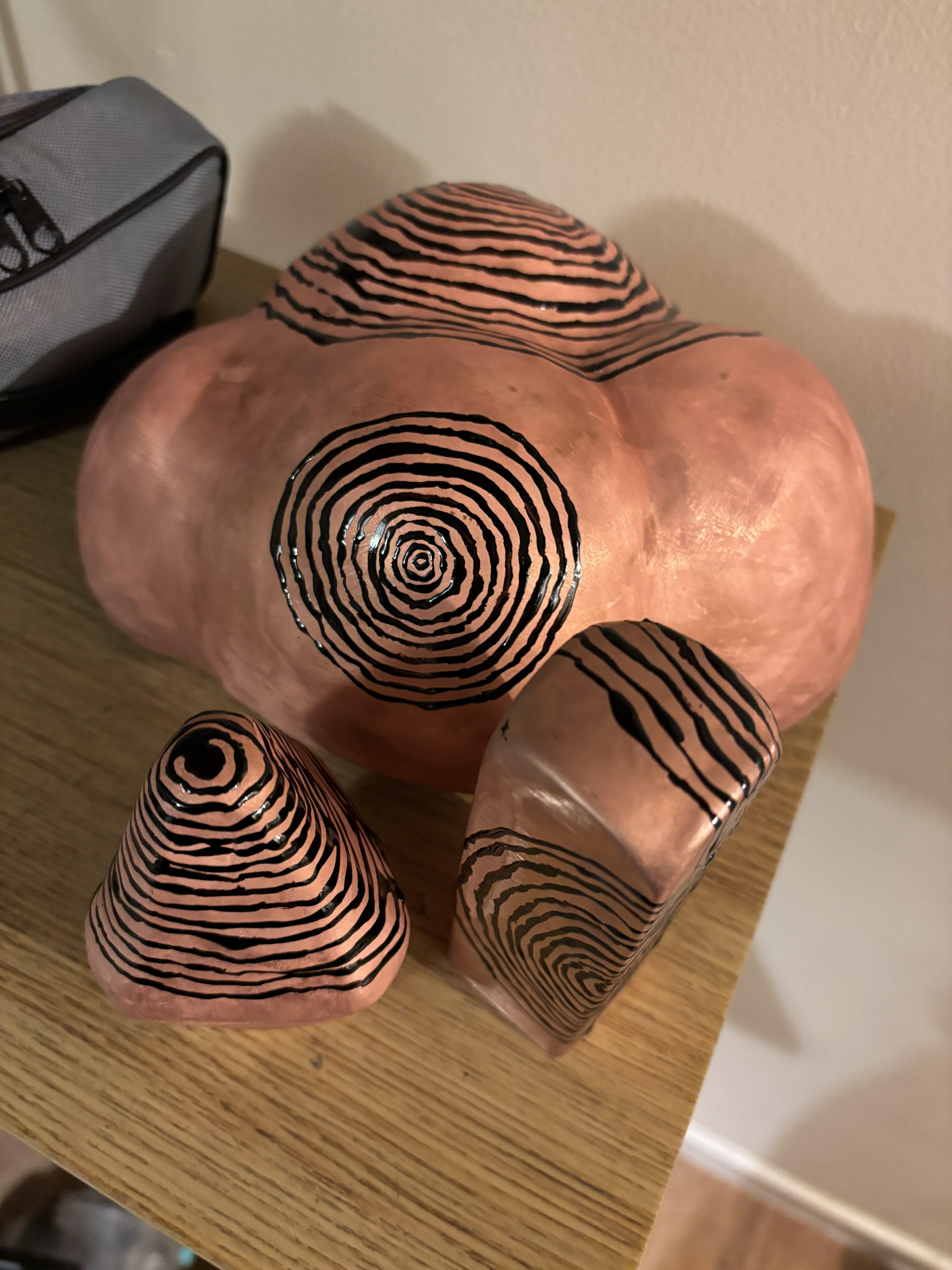
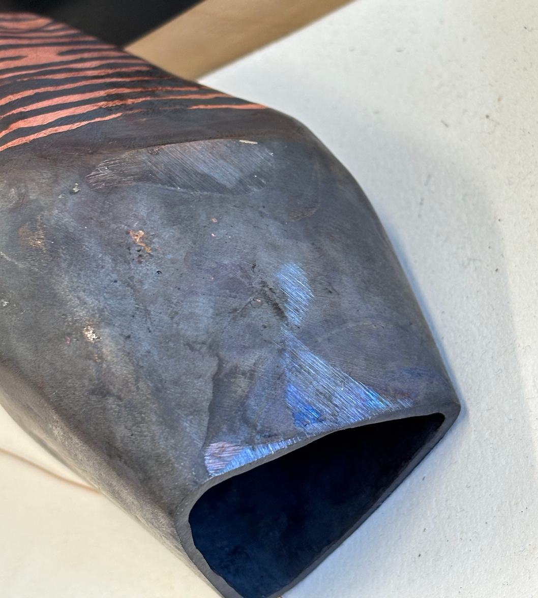
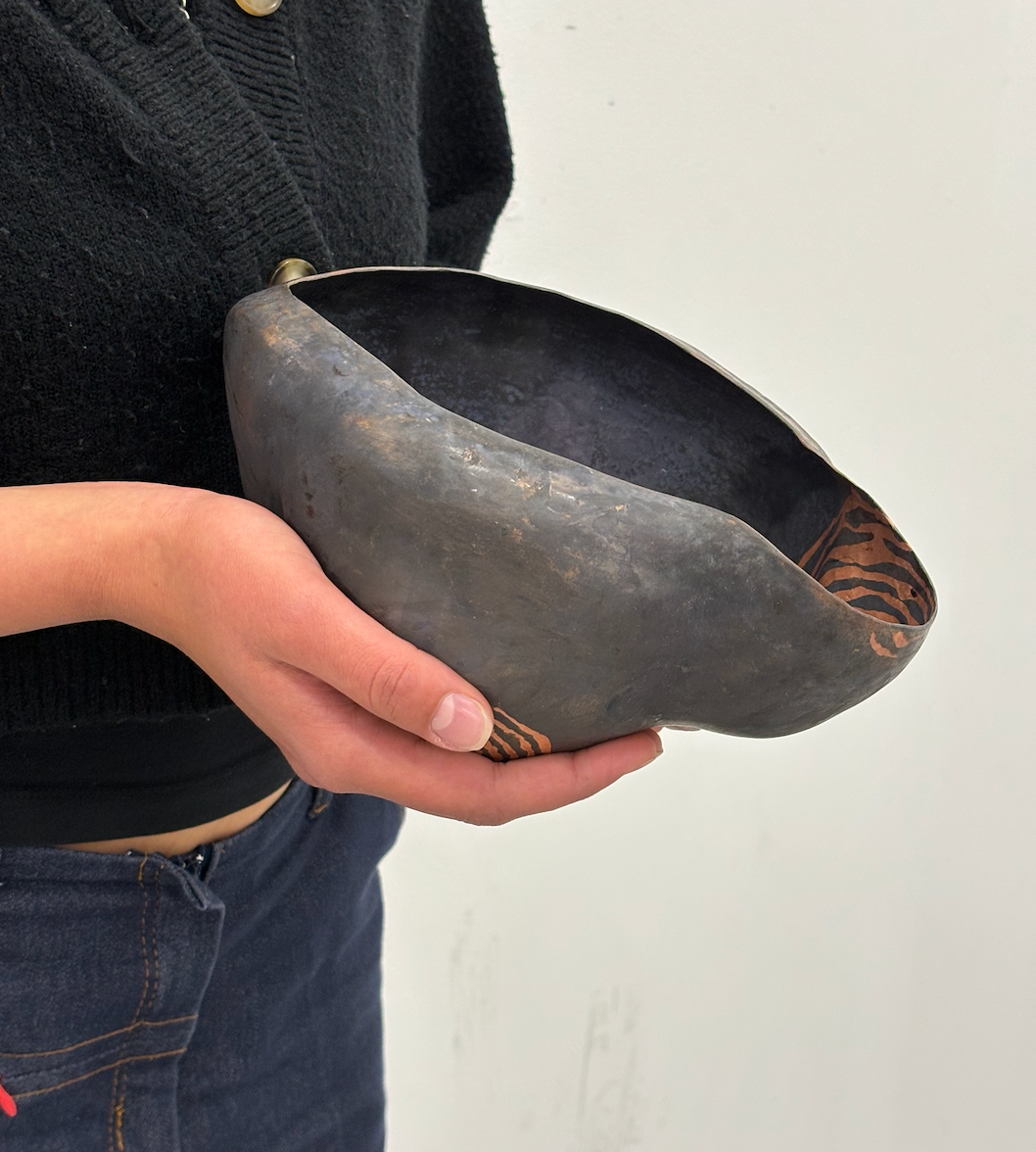
Below are some samples made by sealing the copper, oxidising it with sulphur and then removing the sealing liquid with rubbing alcohol. I also tried out some patina samples but I'm unsure if I will carry on with that in the final piece.
The blackened pieces worked in certain areas but it was difficult to make it look natural and not 'too clean'. The subtle lines in the second image were made with wire or foil, it gives the illusion of a more natural ageing.
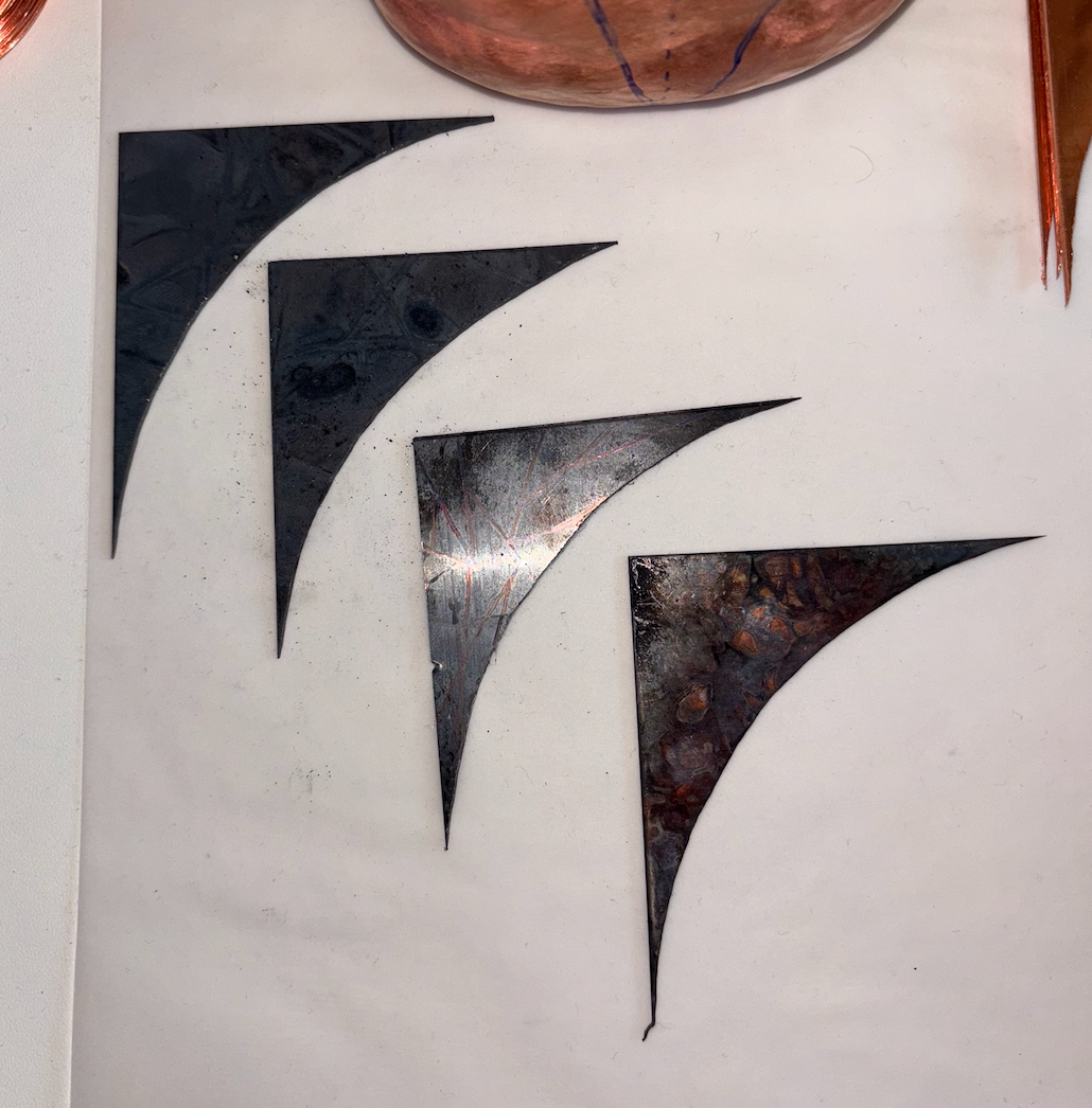
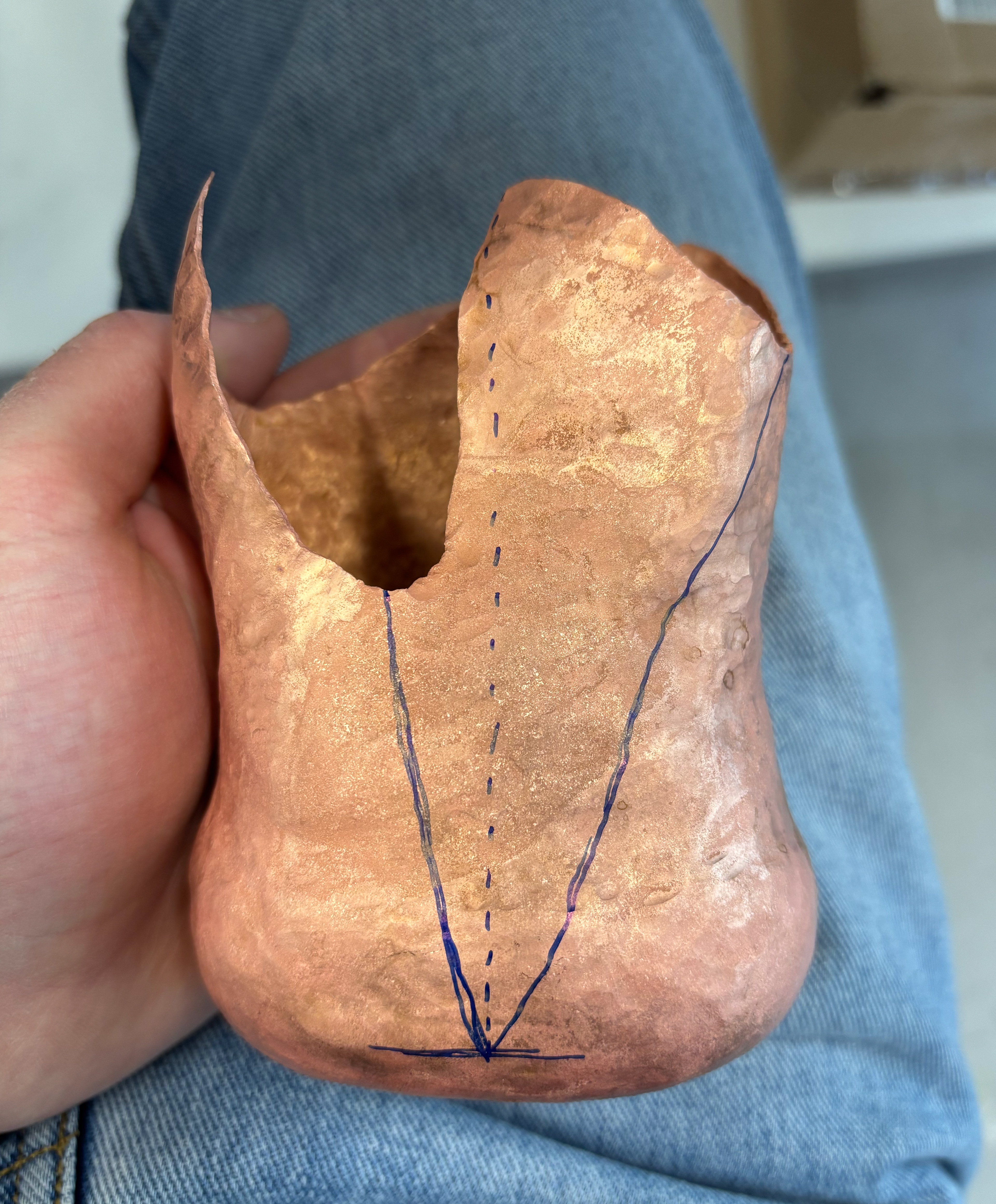
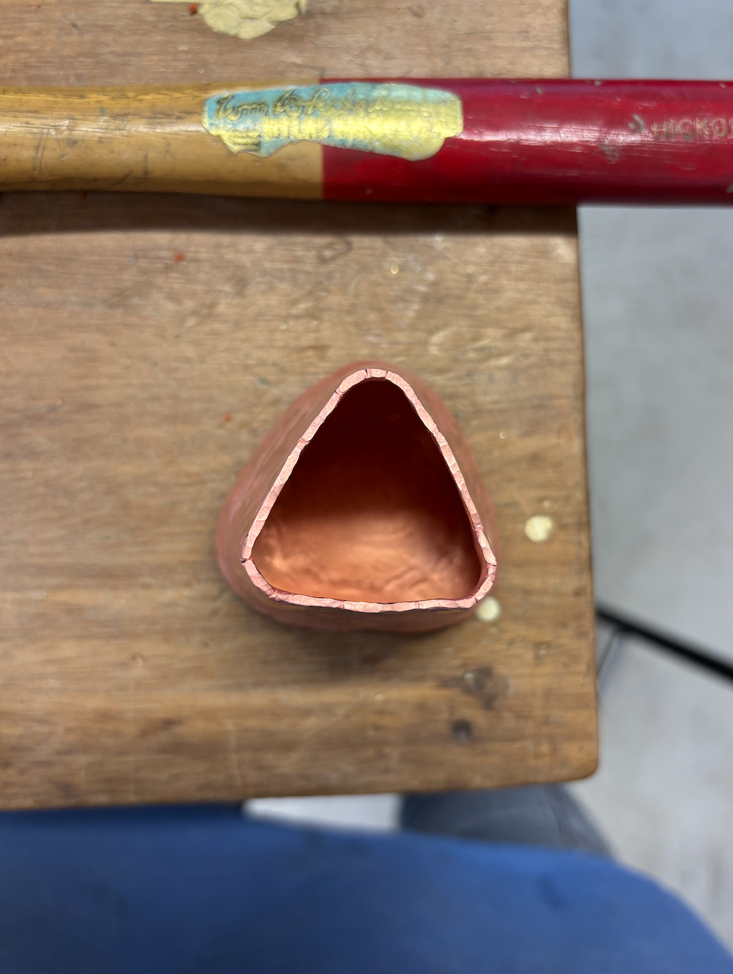
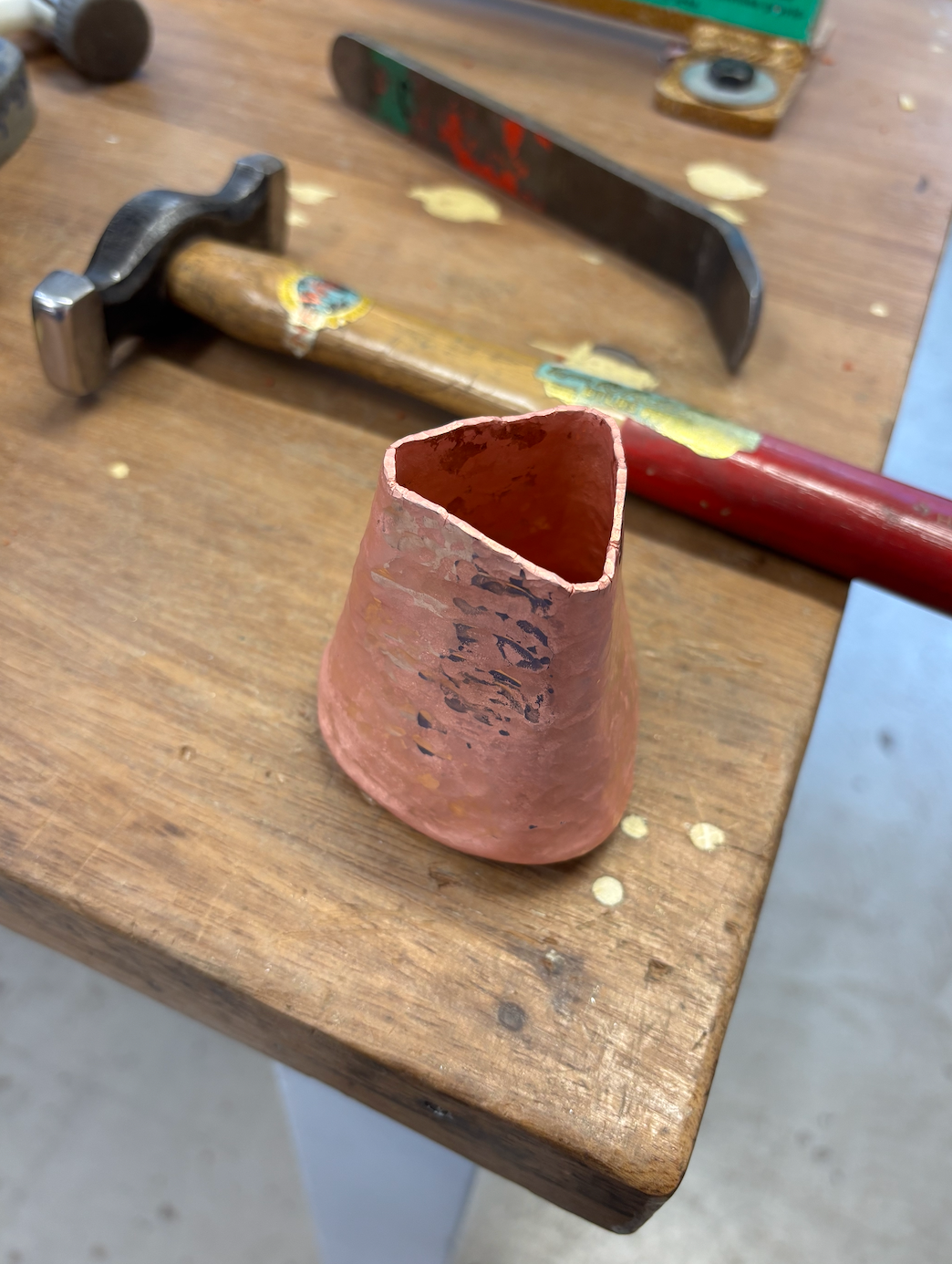
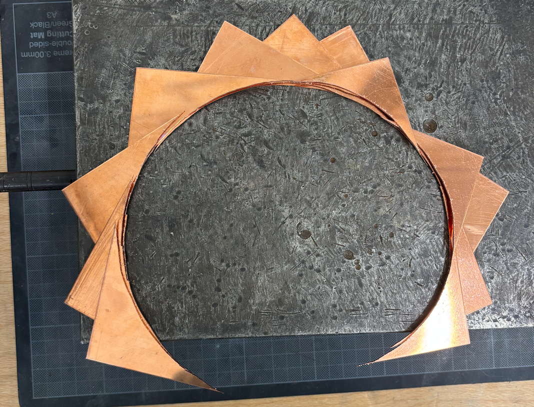
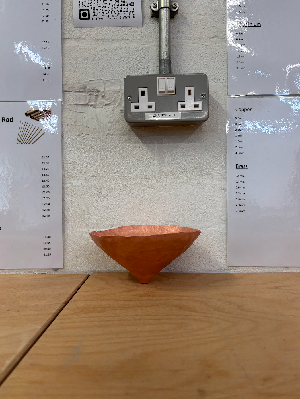
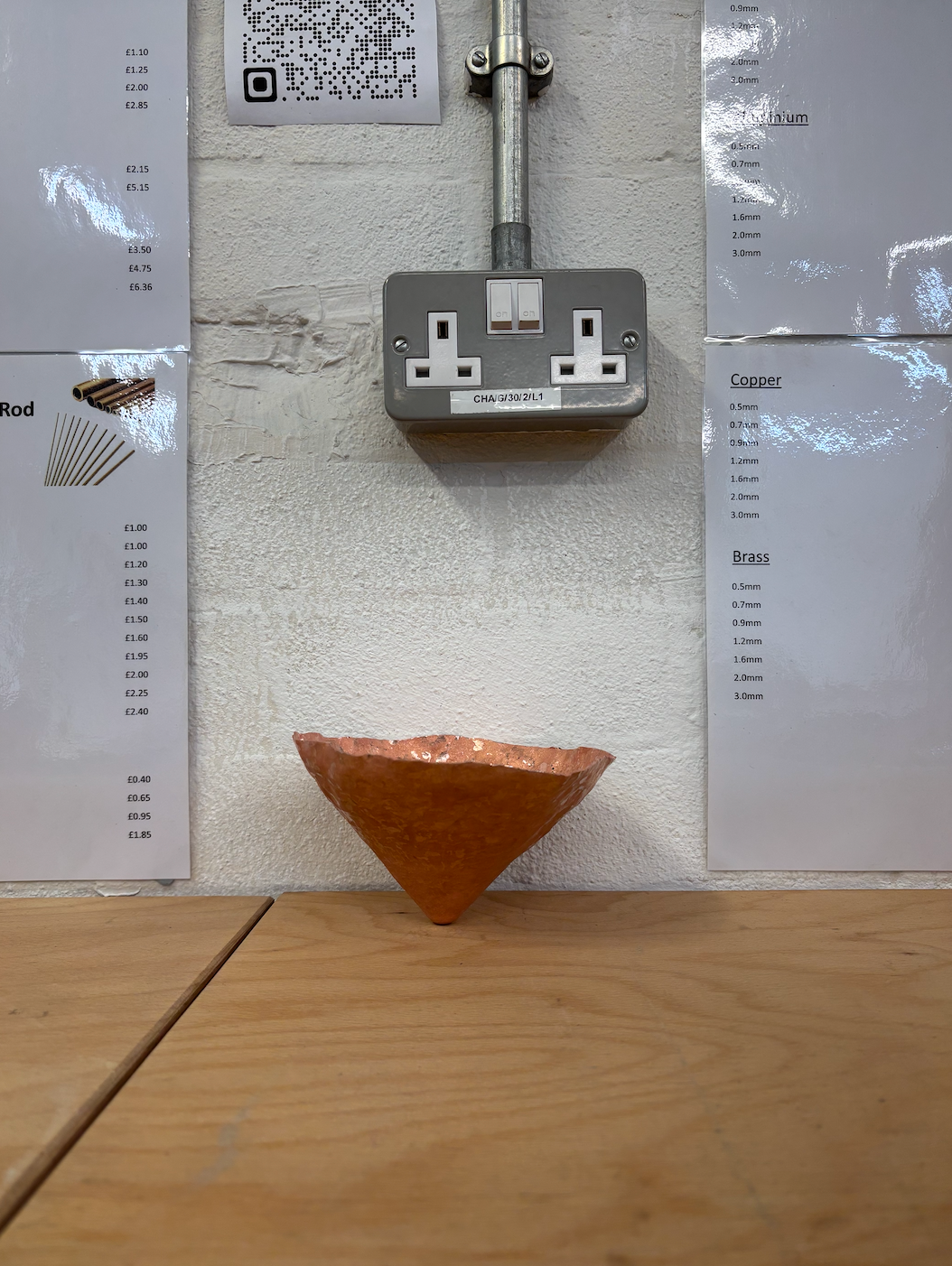
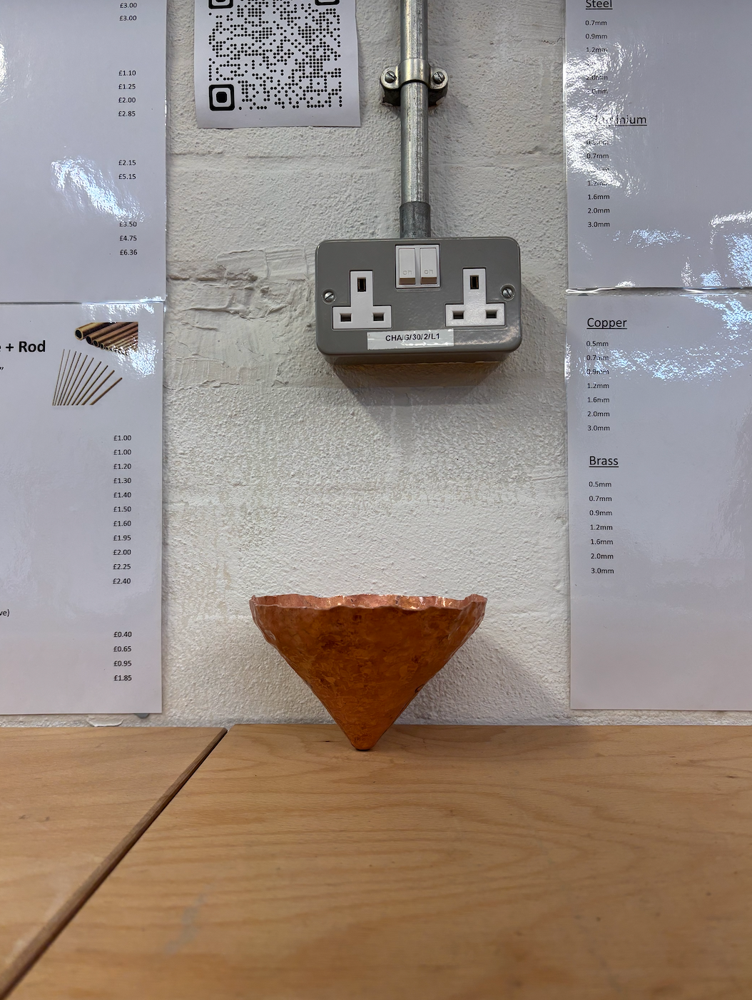
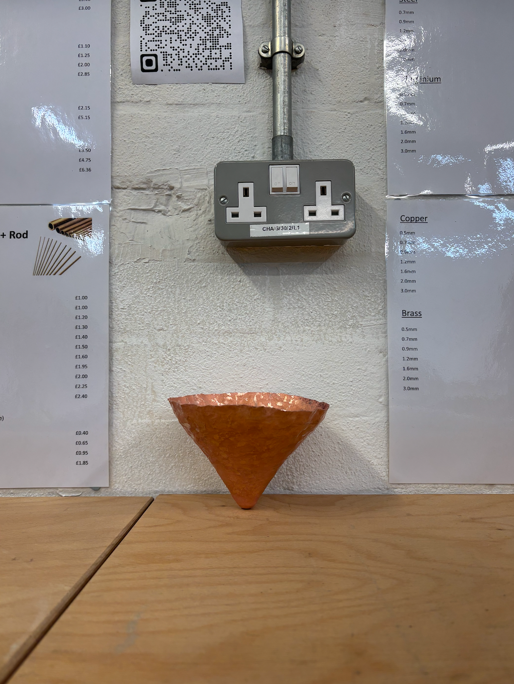
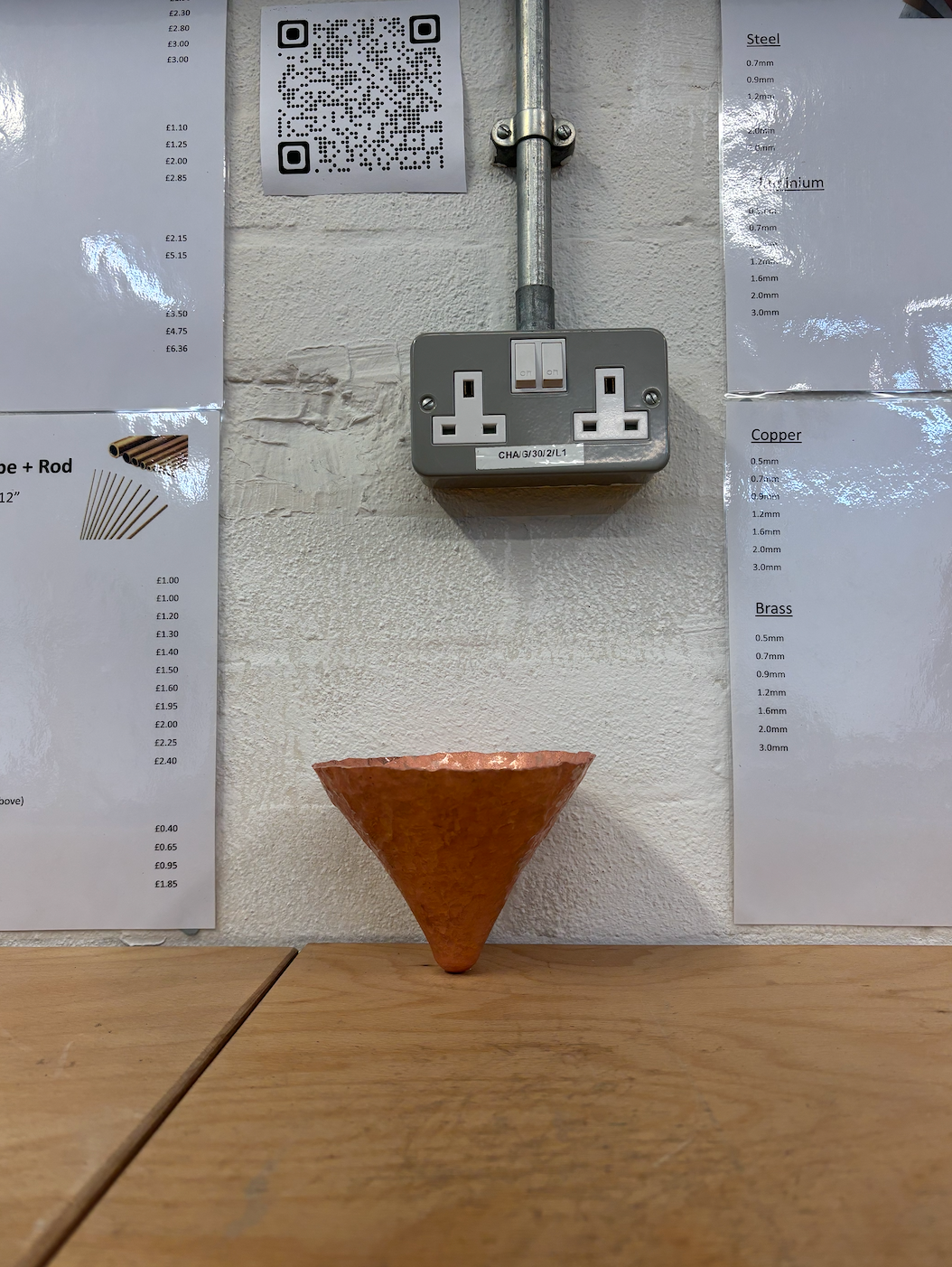
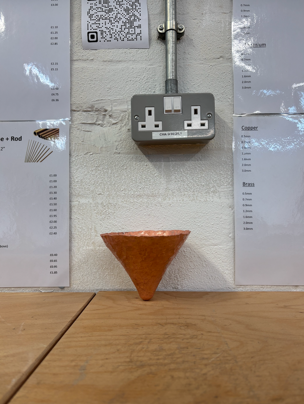
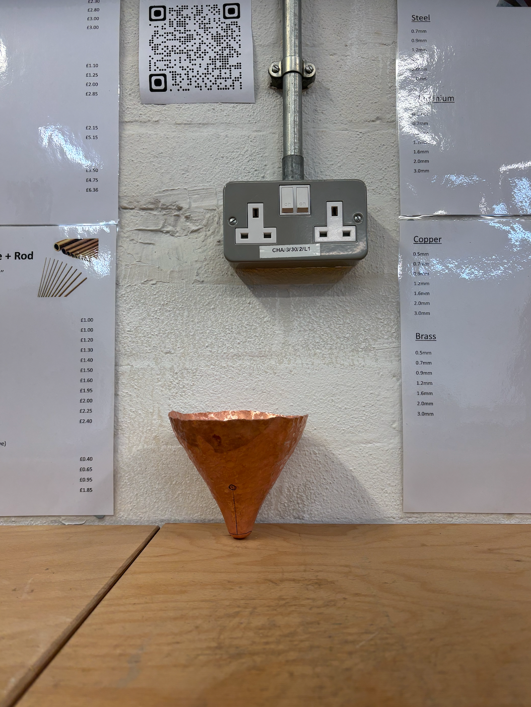
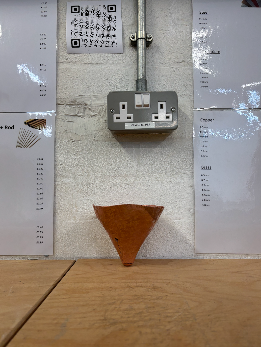
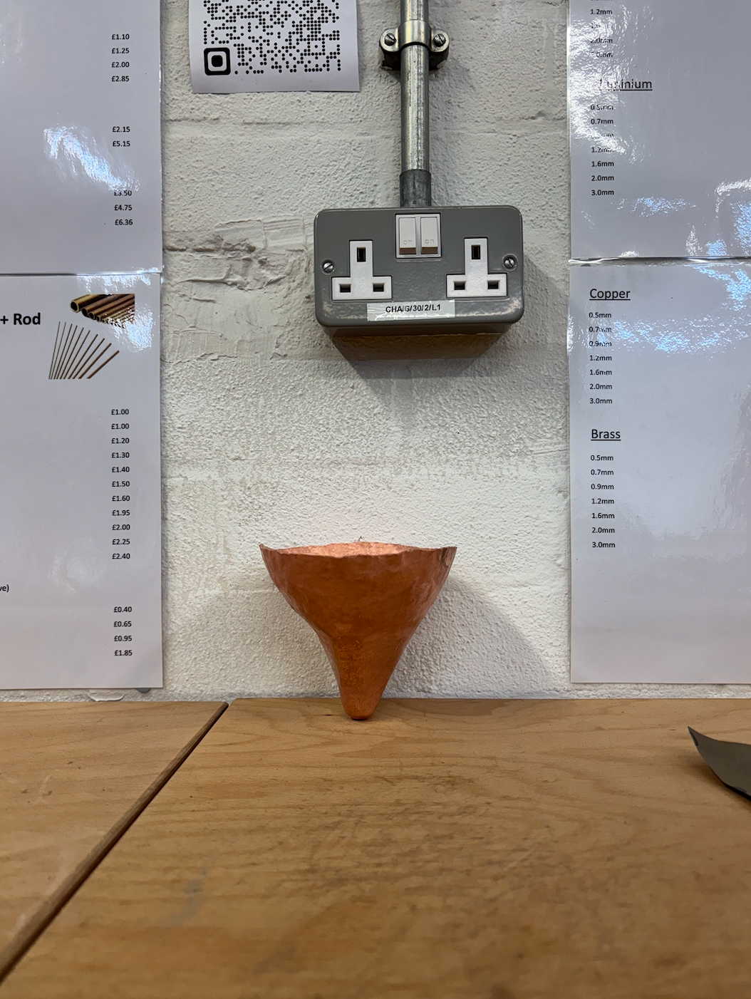
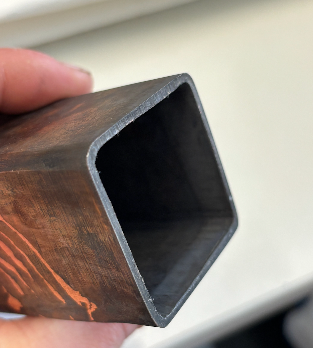
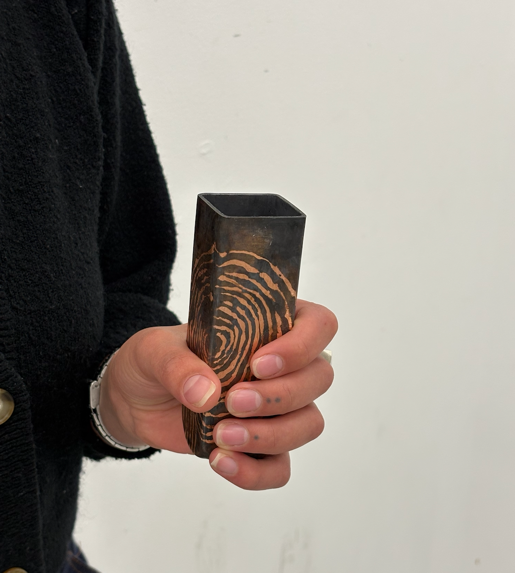
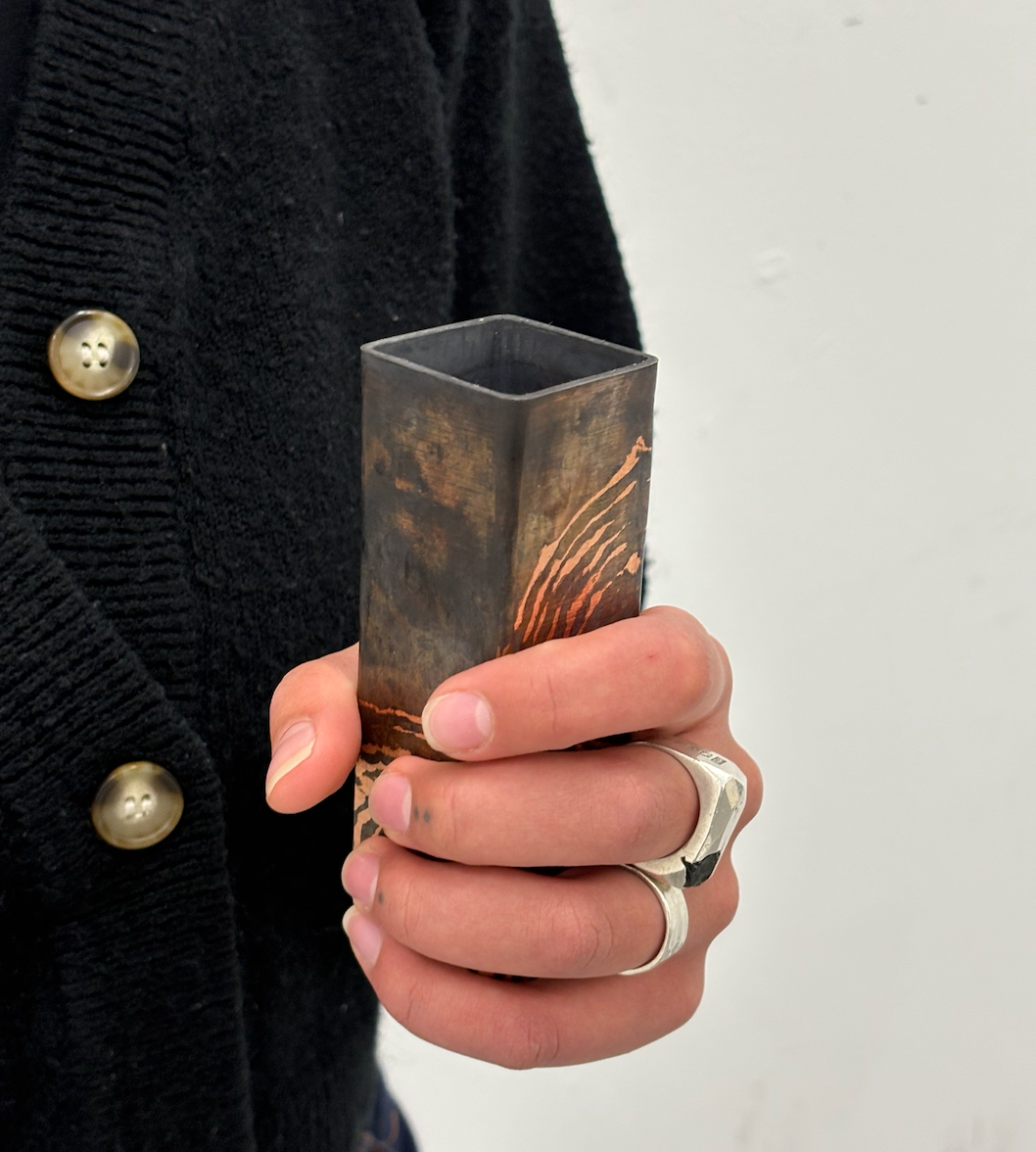
The triangle sample was informed by my desired final outcome of geometric, simple, 'manmade' shapes. The process is relatively easy; a shape is formed and then the desired faces are flattened out. The negative in this sample is the base, which is bumpy as I didn't planish the piece in the correct order; the planishing should start much earlier when the base is at its desired shape, I found it difficult not to continuously push the vessel onto the stake, in turn, having to rework the base several times.
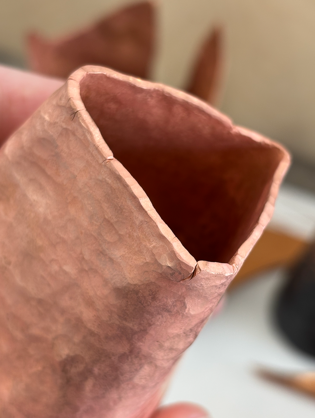
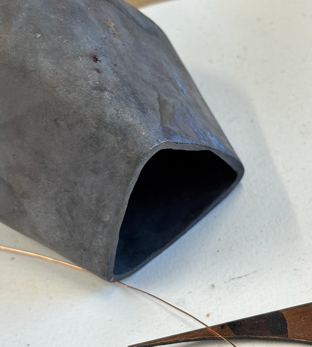
Cracks appear at the mouth of the vessel due to me putting too much stress on it with adding the corners so early and not taking enough care of the edge. When working on a shape that goes inwards, caulking the piece is KEY.
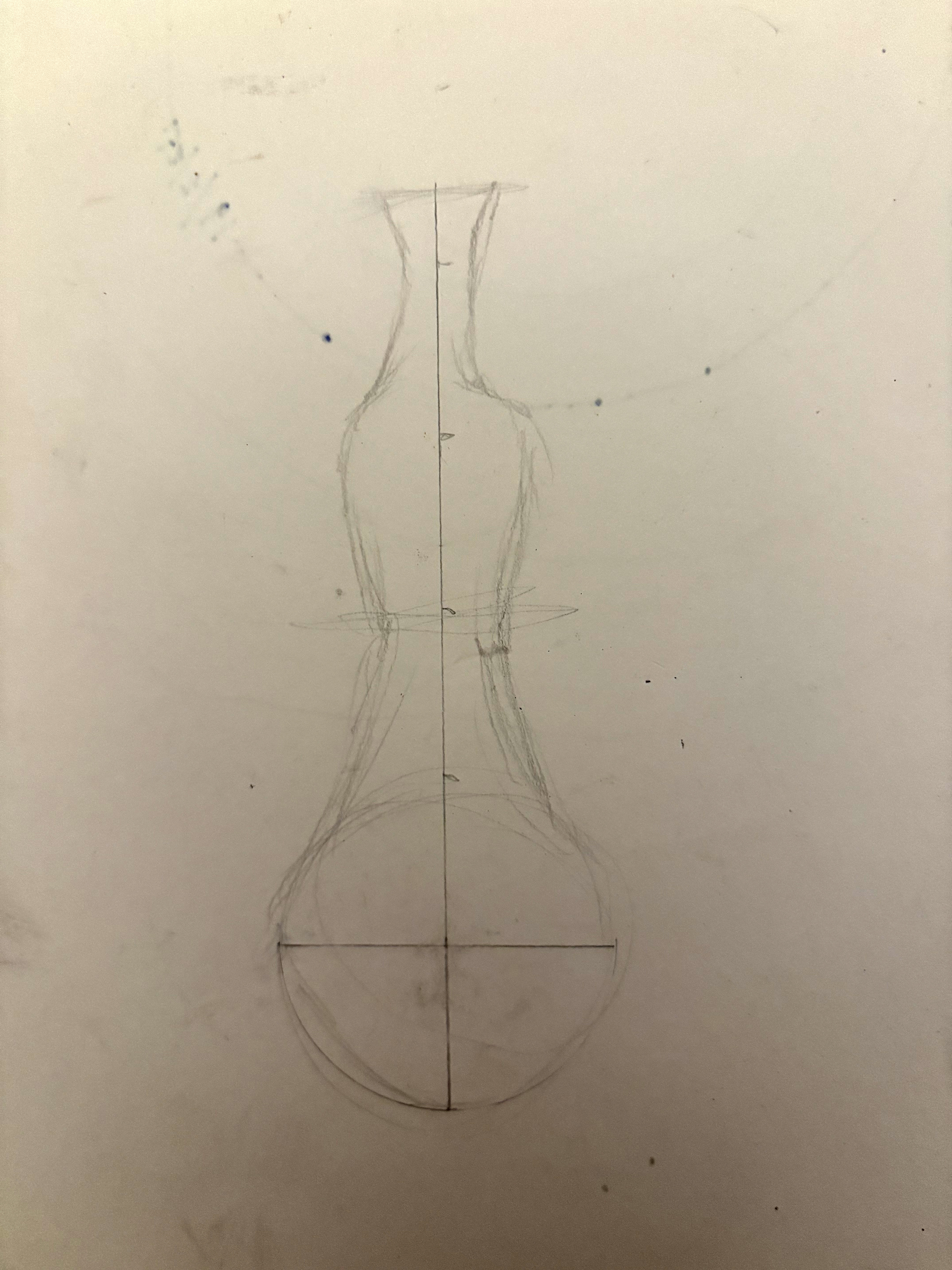
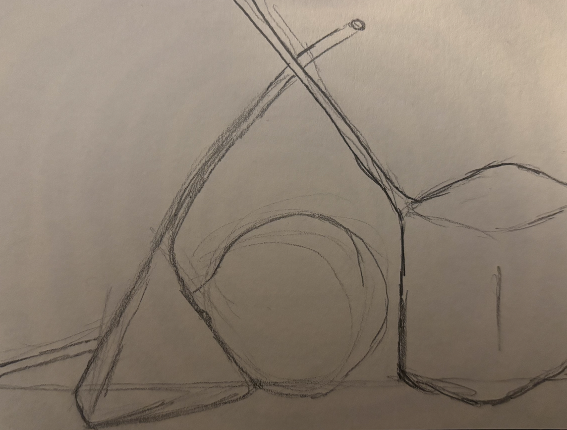
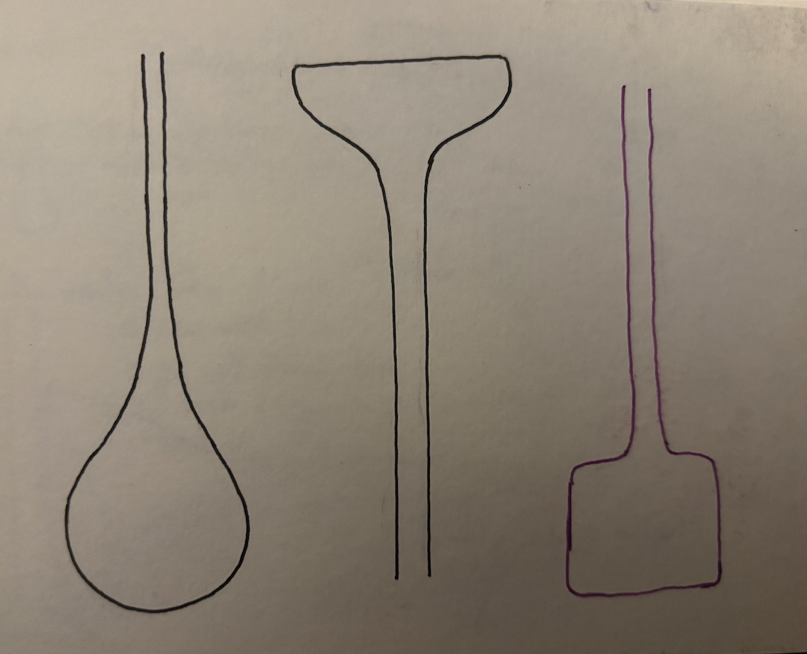
Here are some initial sketches from this stage.
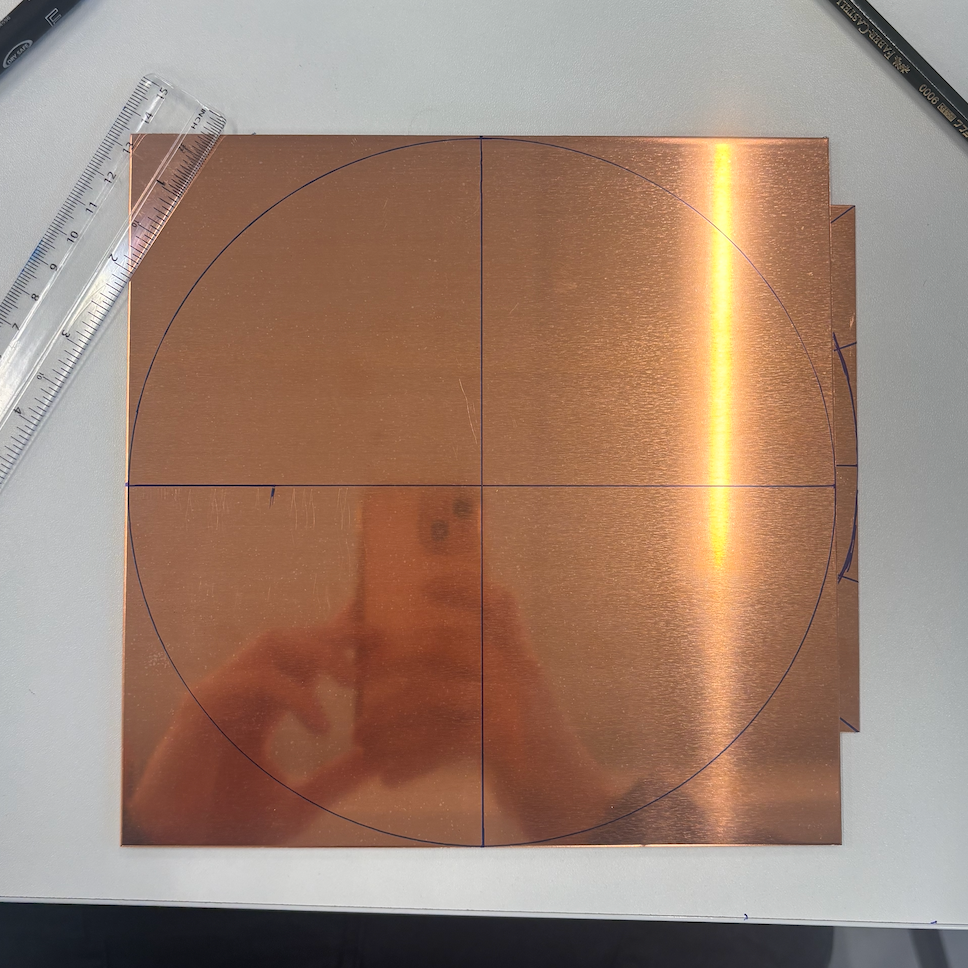
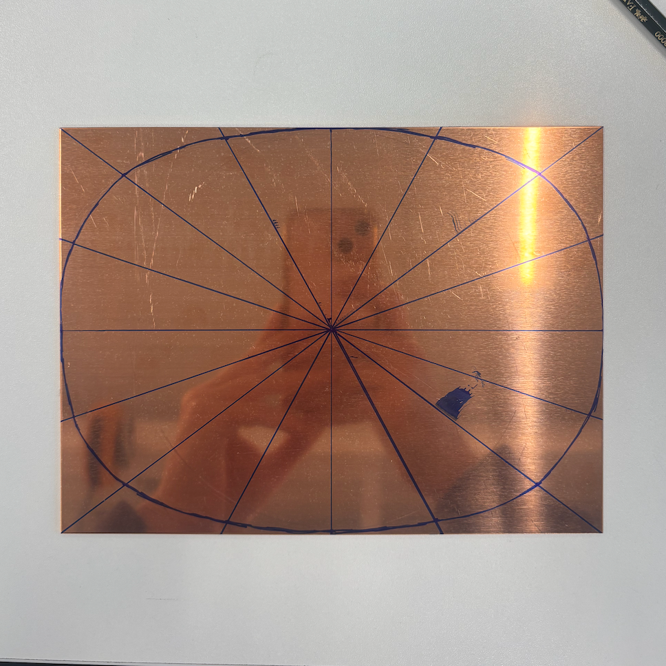
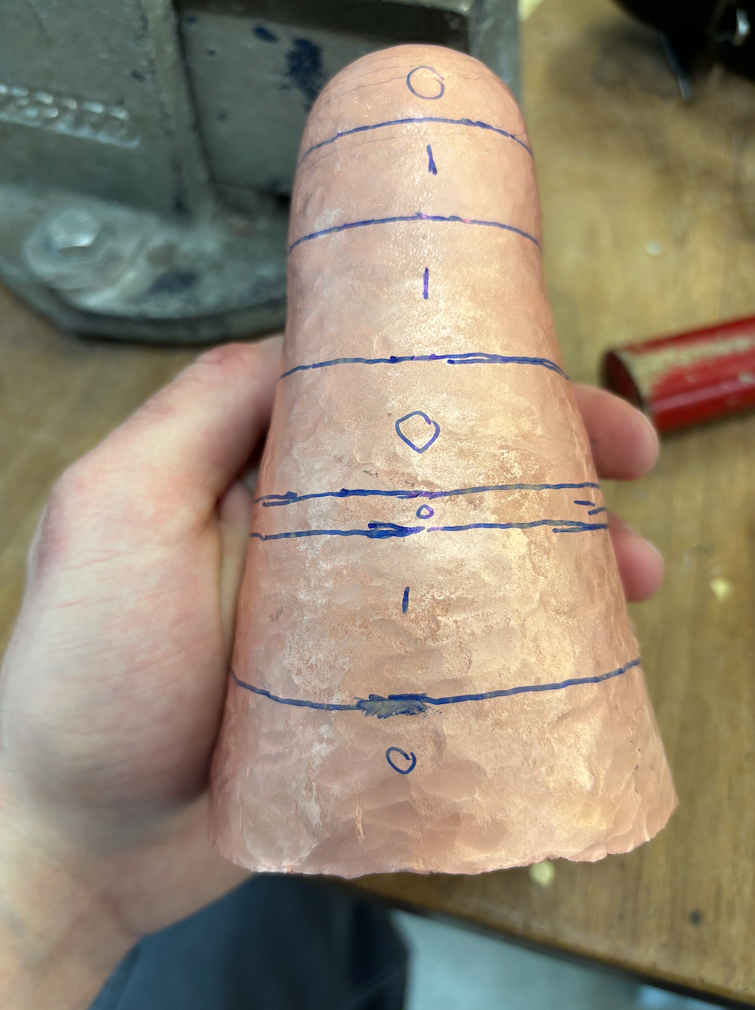
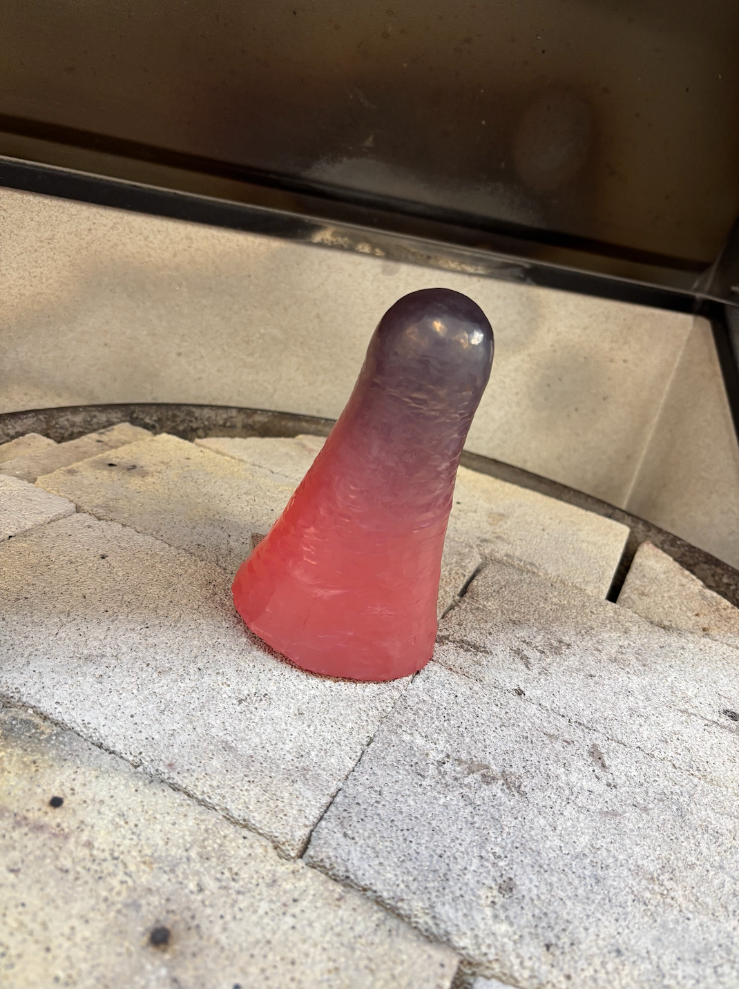
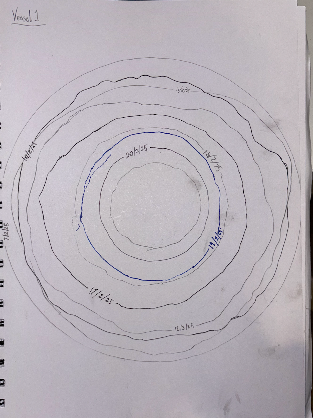
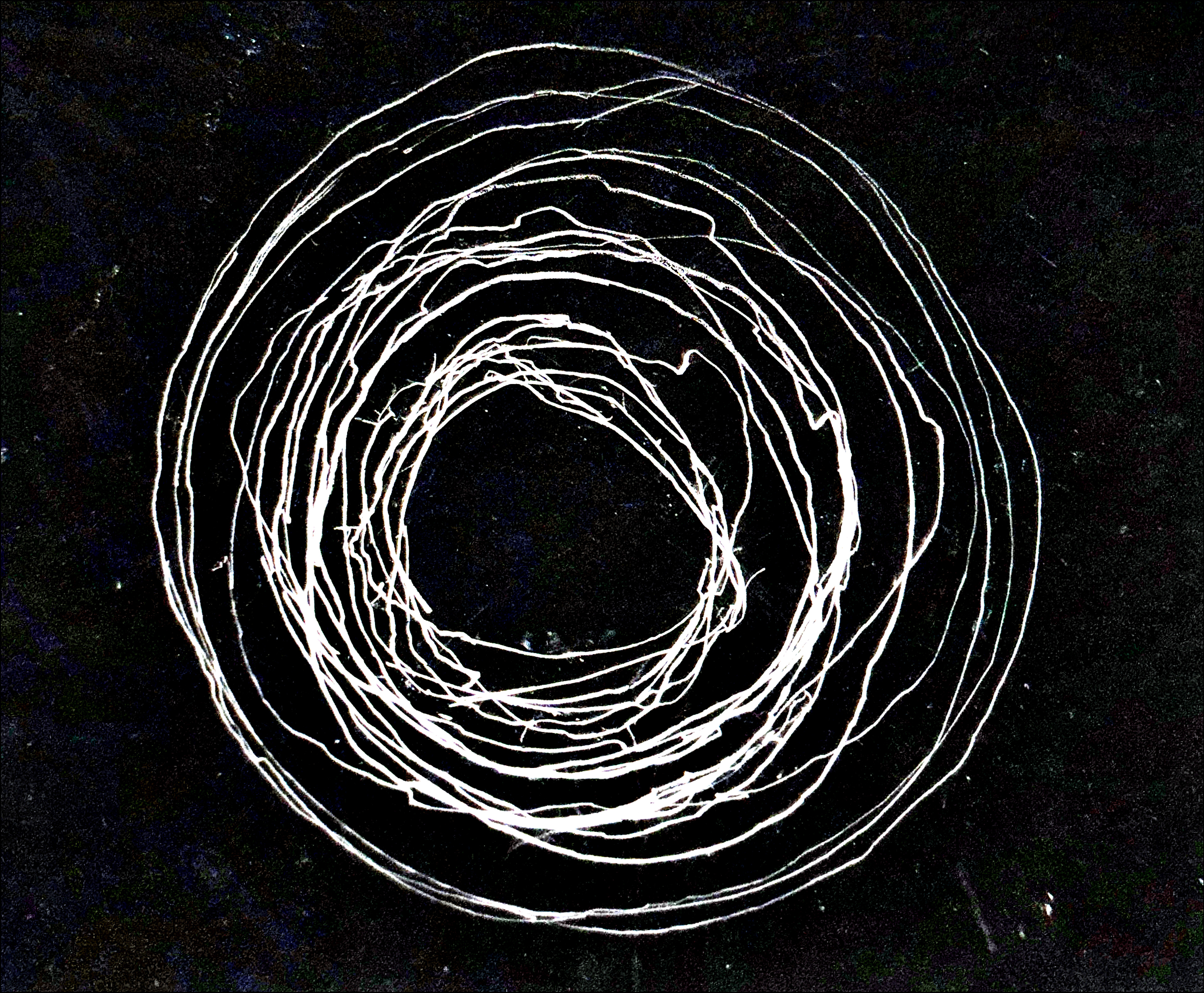
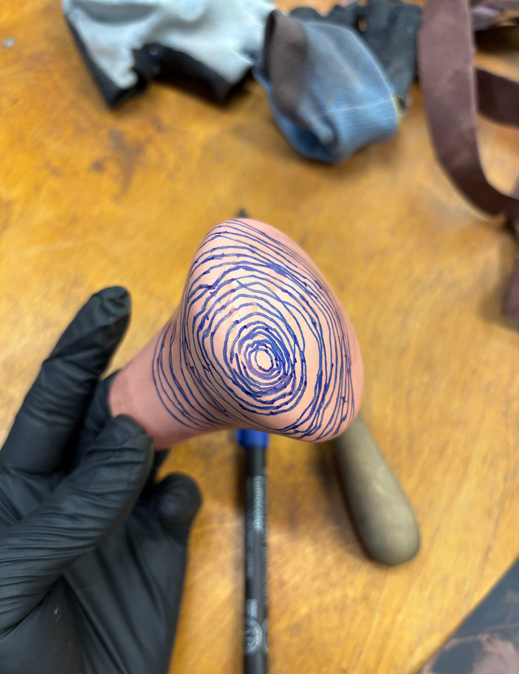
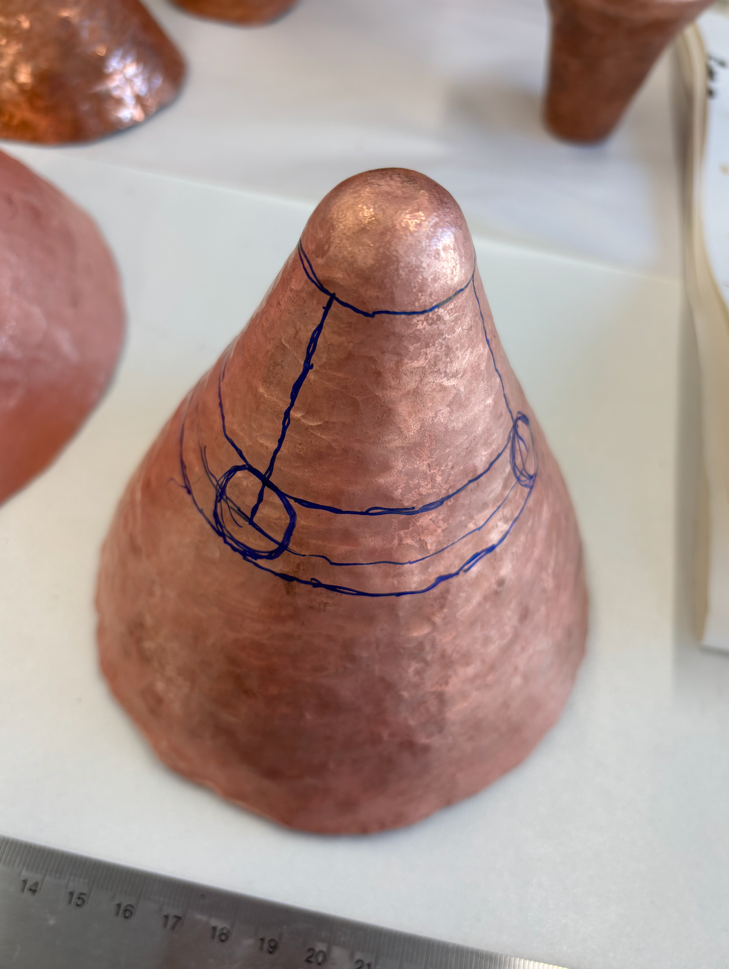
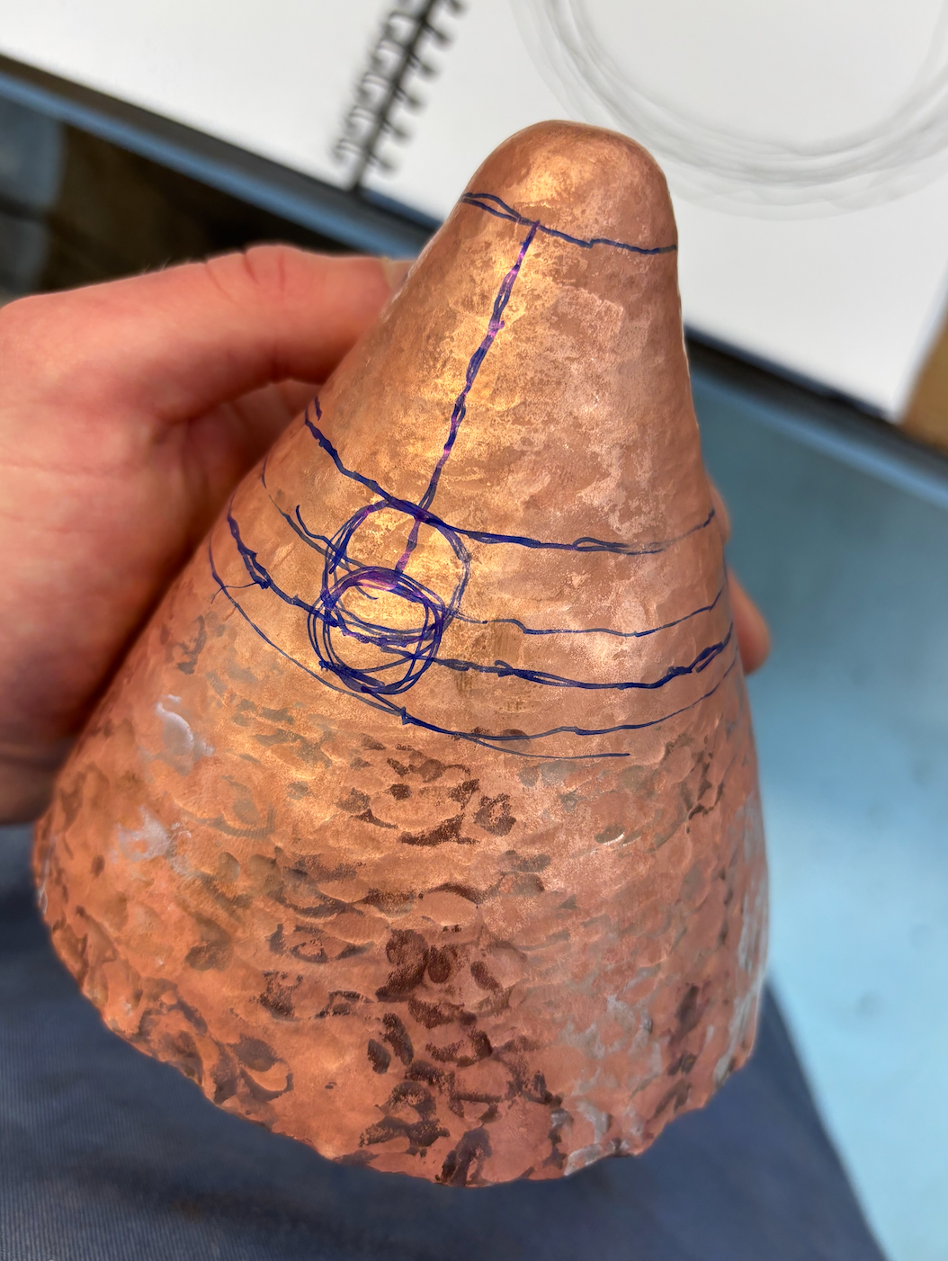
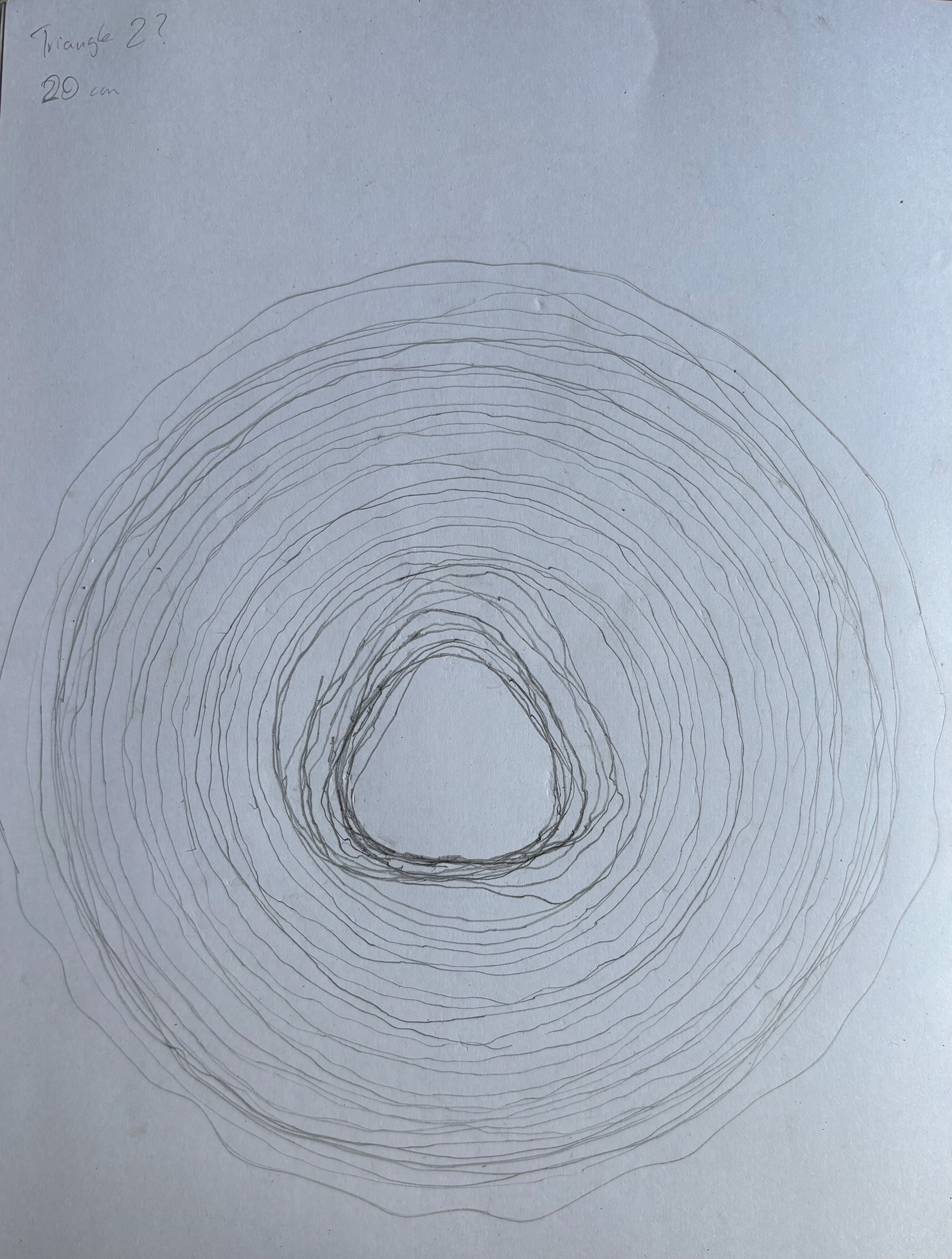
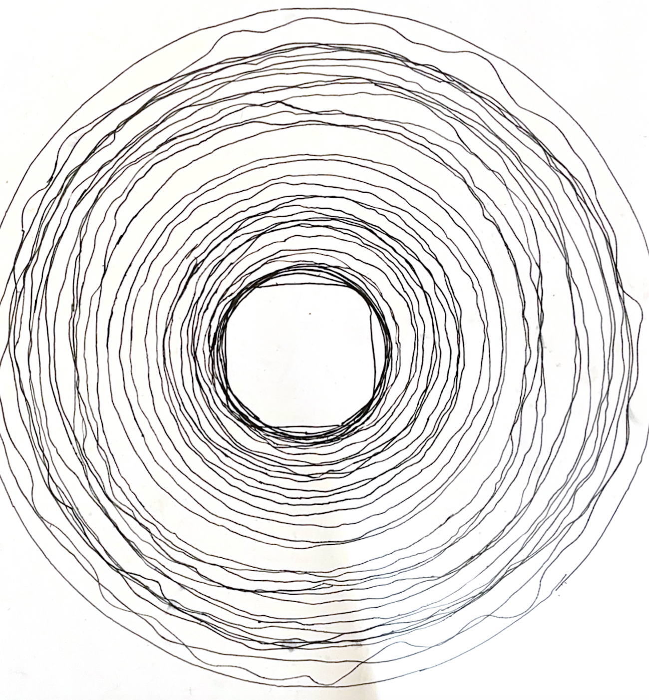
Raising both the samples and beginning the final pieces, it was important to document the circumference of the vessel at the top to track progress. The images that come from this are very mysterious when viewed without insight. The edited images are below:
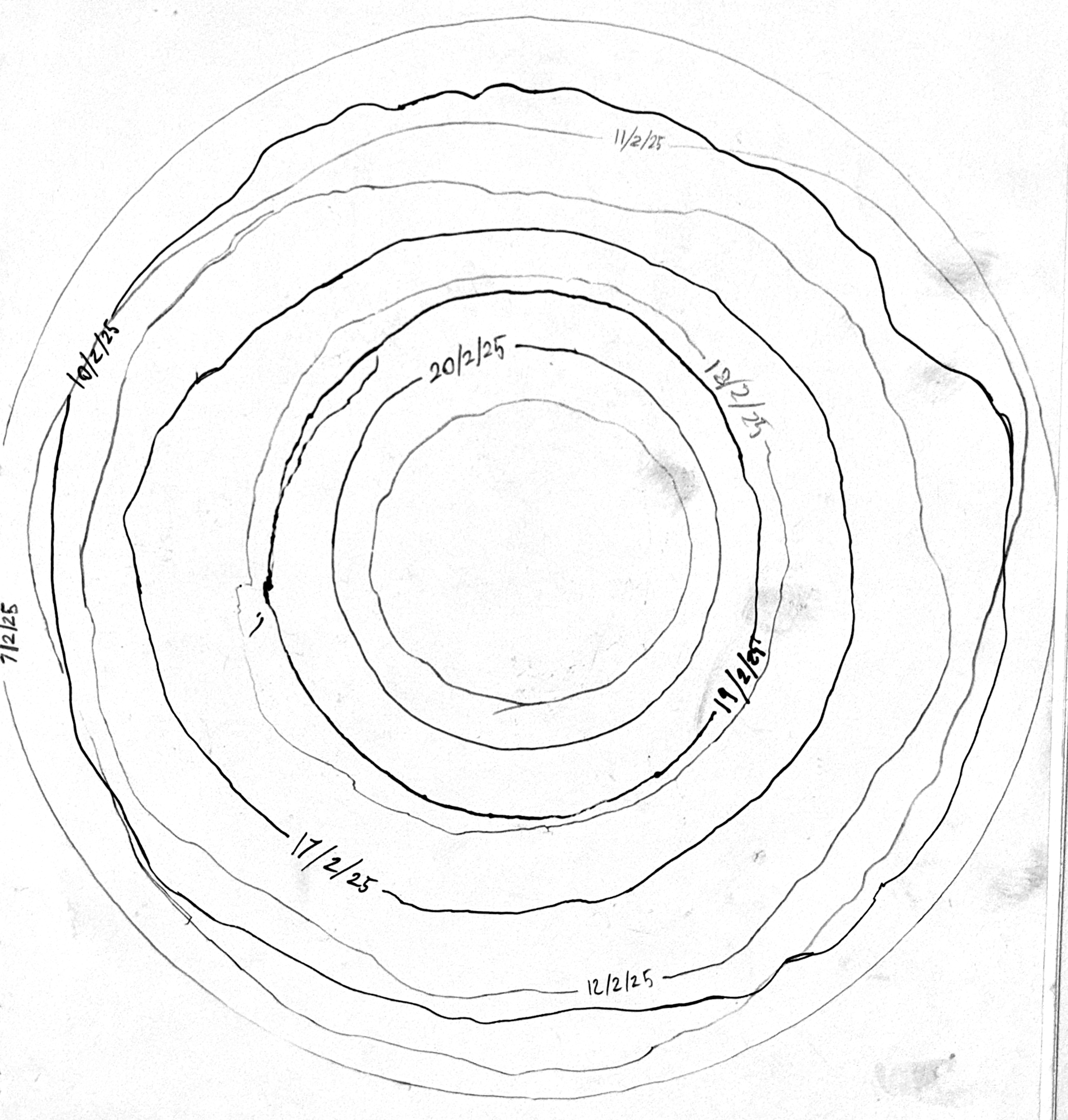
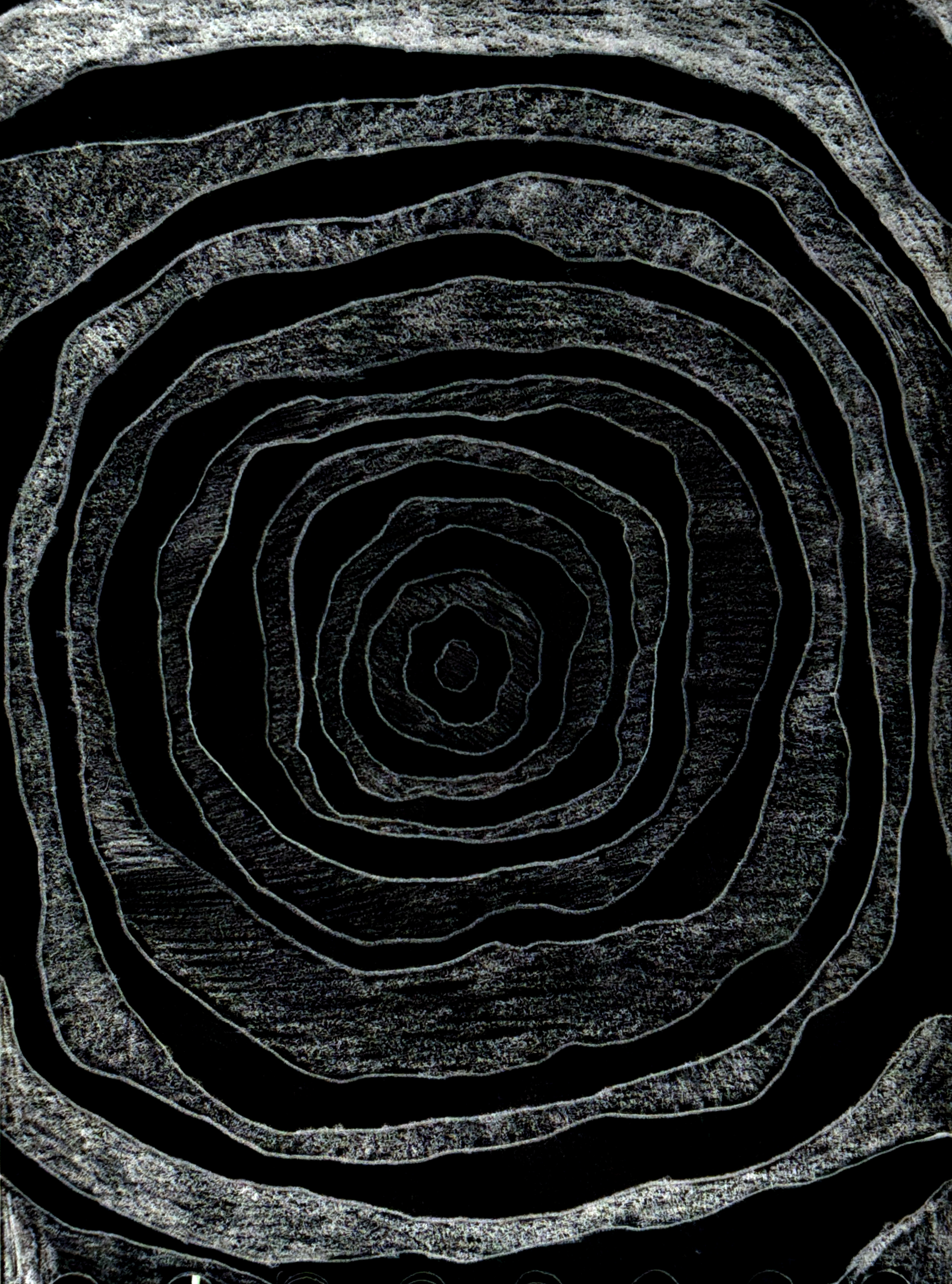
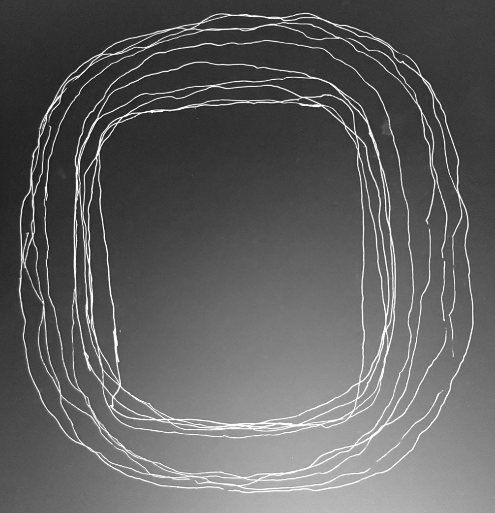
It's interesting how the edits change your perception of the drawings. The can be light, orbits, recordings or cave paintings... Their inclusion in the archival extract is needed. They could be written about in a speculative manner, relating to themes of museums and incorrect information. Misleading the audience is key to the project so my purposeful misinterpretation of my work would be an interesting point to the narrative of the pieces.
This document was interesting because of how empty it was. It's very ominous, its almost translucence is mysterious.
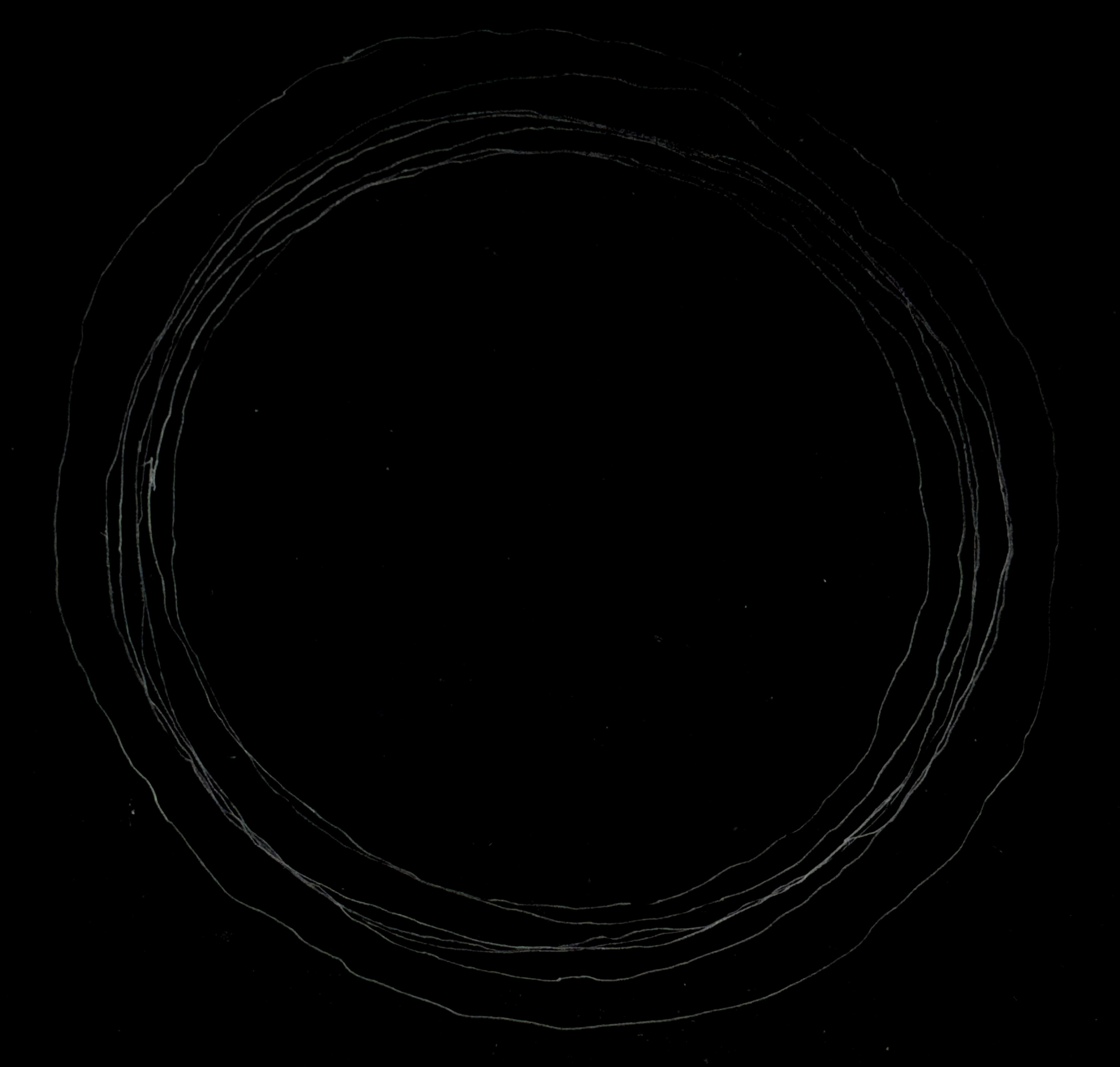
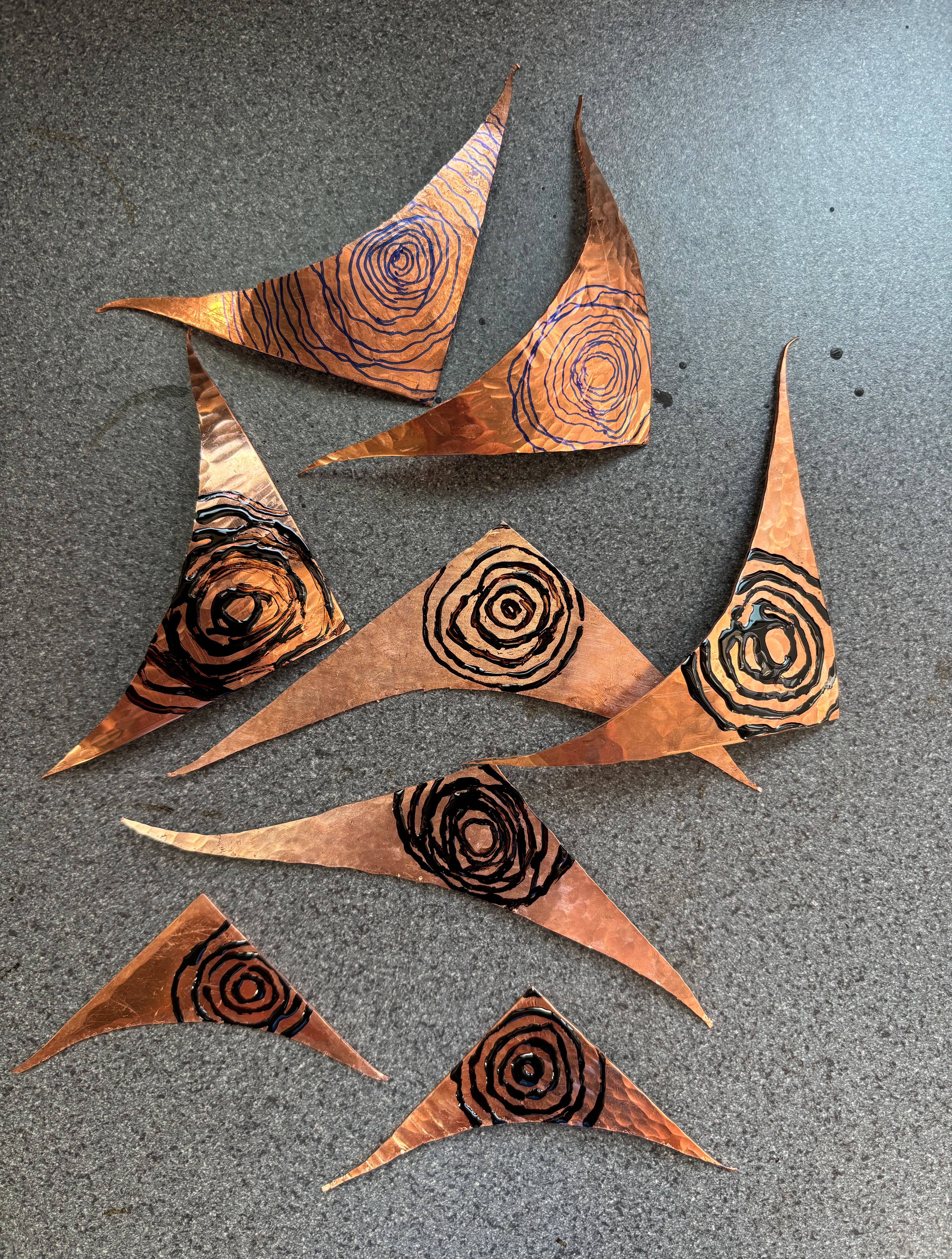
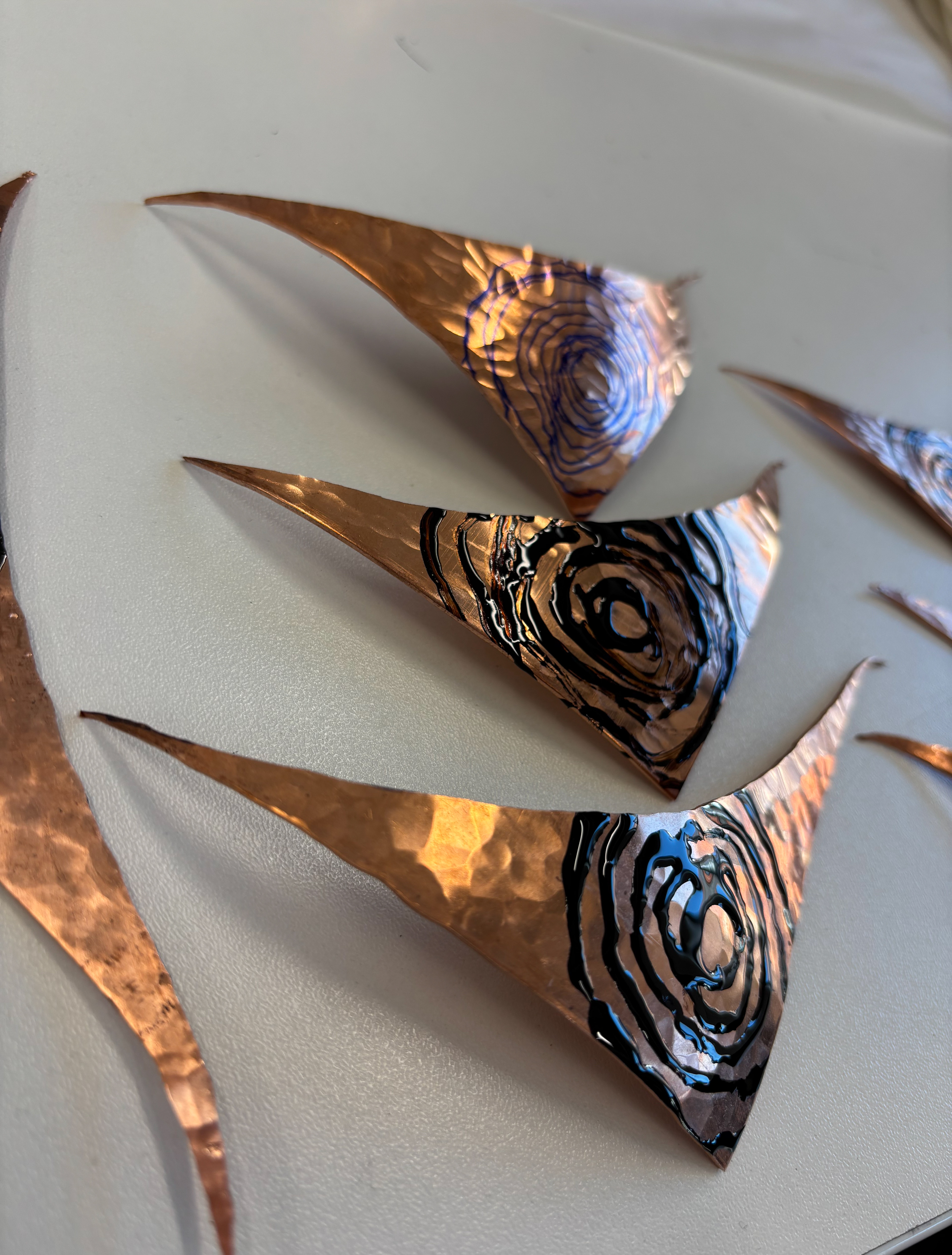
The shapes below, however, were there highlight of the experiment. They were sinister.
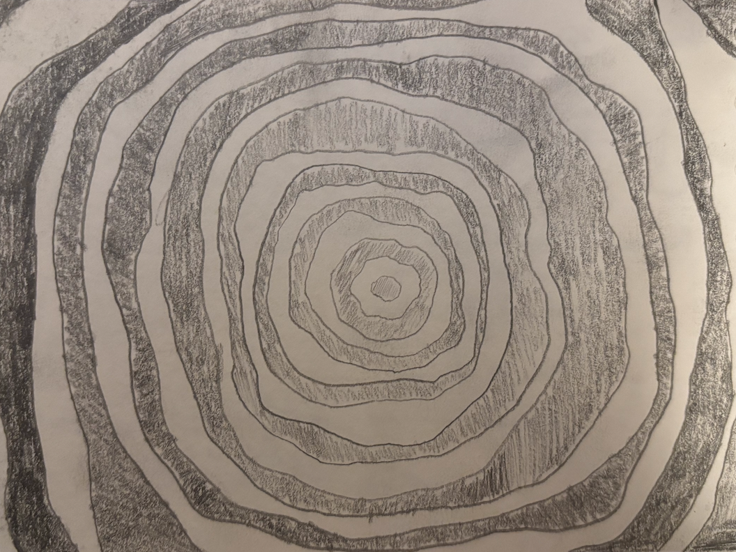
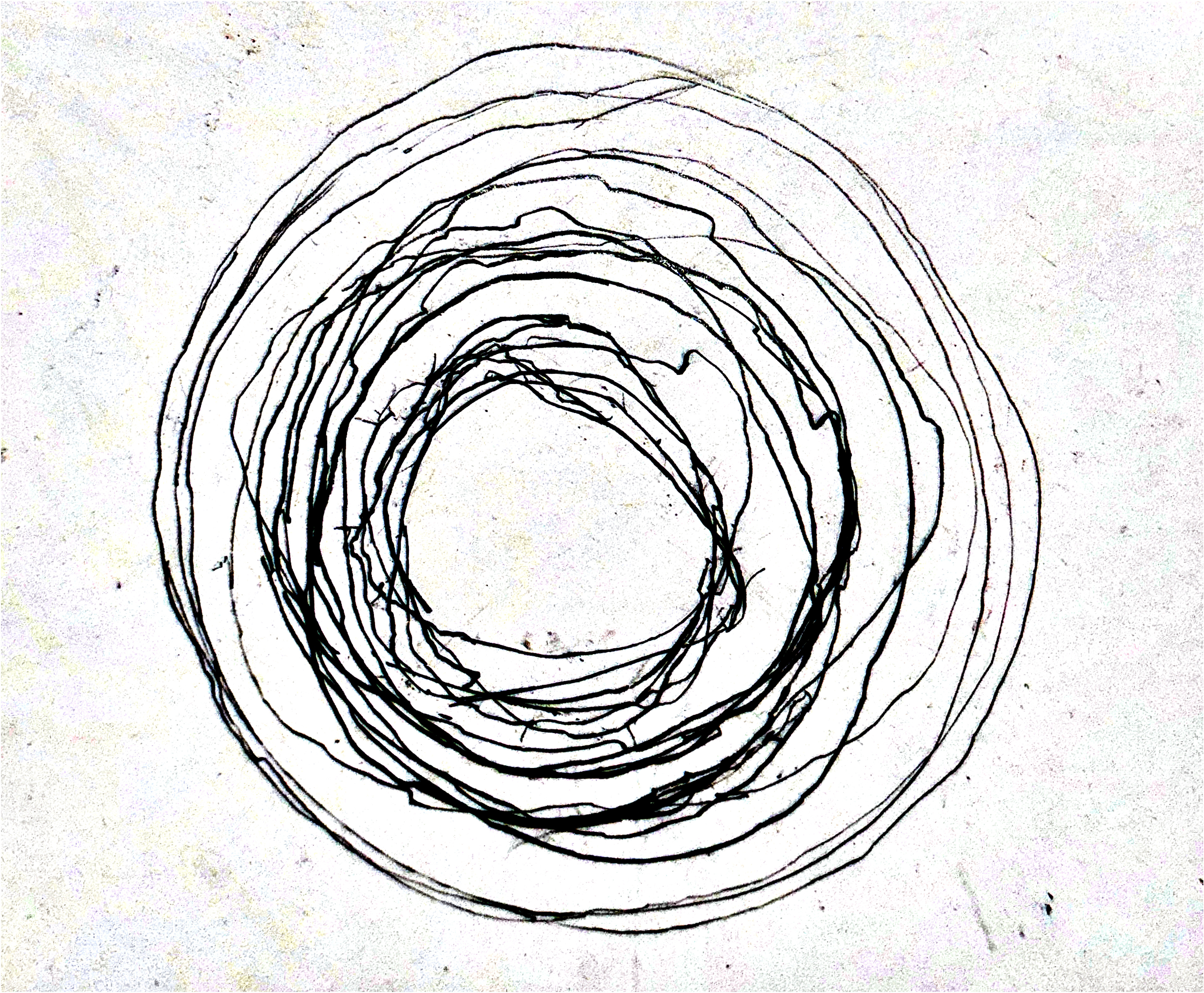
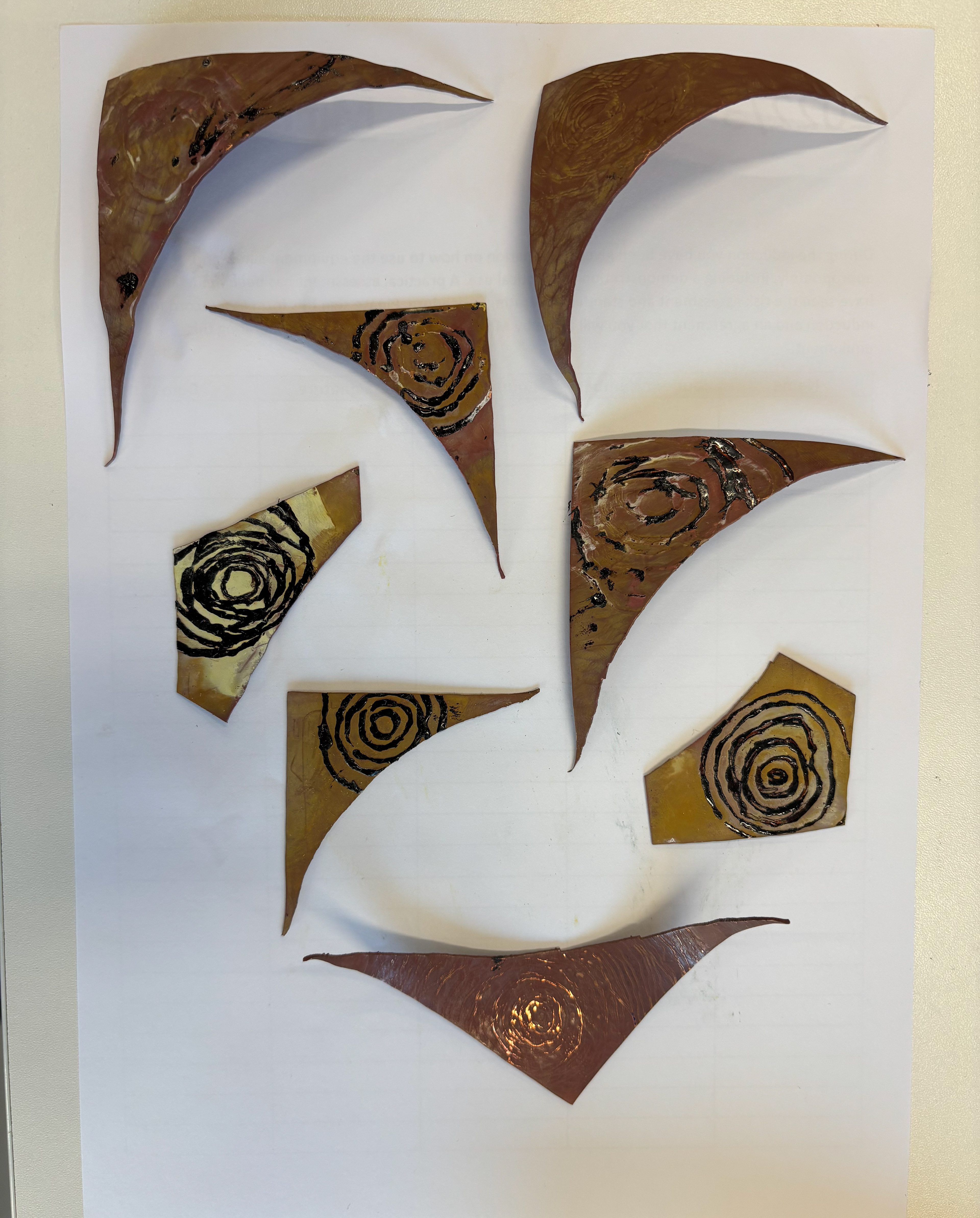
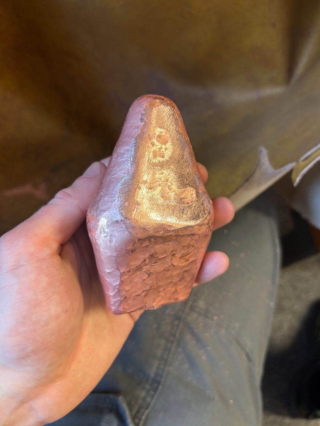
These were taken from the triangular tip vessel and, in my eyes, depict the random nature of the metal. It's a shape that can't be repeated, from the line work to the intersections, and it's all traced around a piece of copper.
From the point of the project, the shape is a sign with no real meaning if not contextualised. I can say it represents anything, depending on what the final context document is based on.
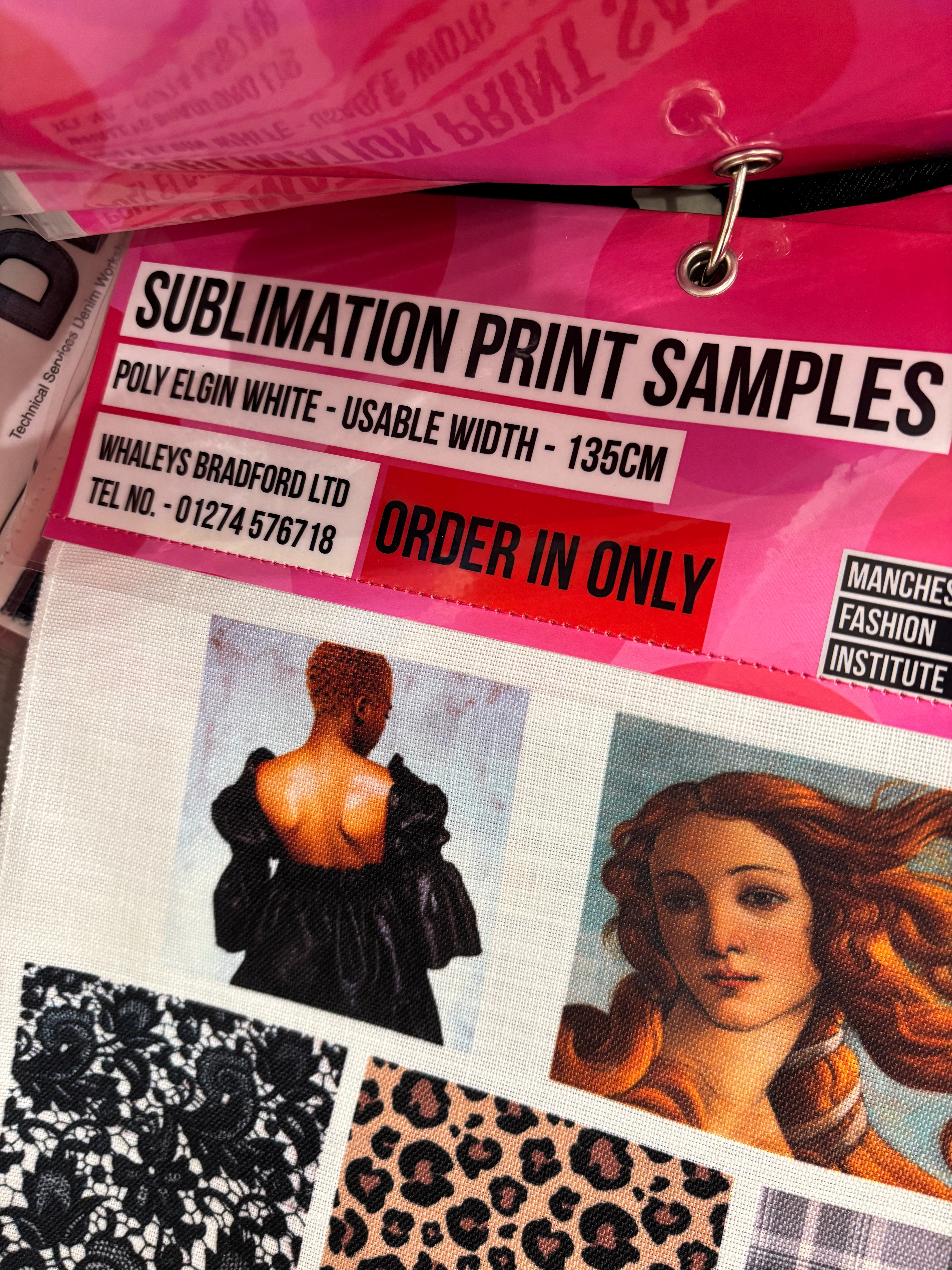
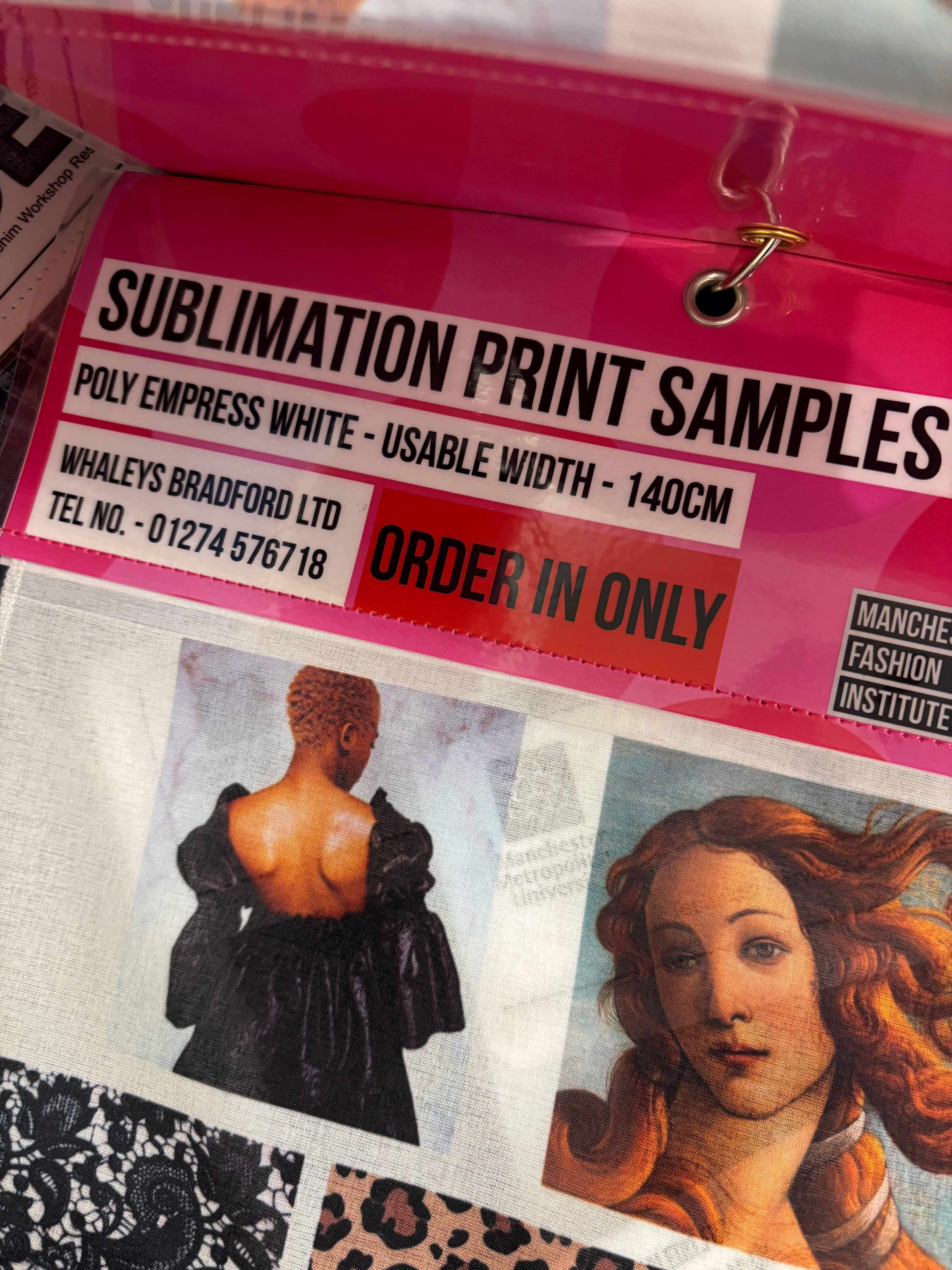
I adapted these circle designs into metal samples to see how feasible it is to paint them on using different methods of sealing. I then acid etched the samples.
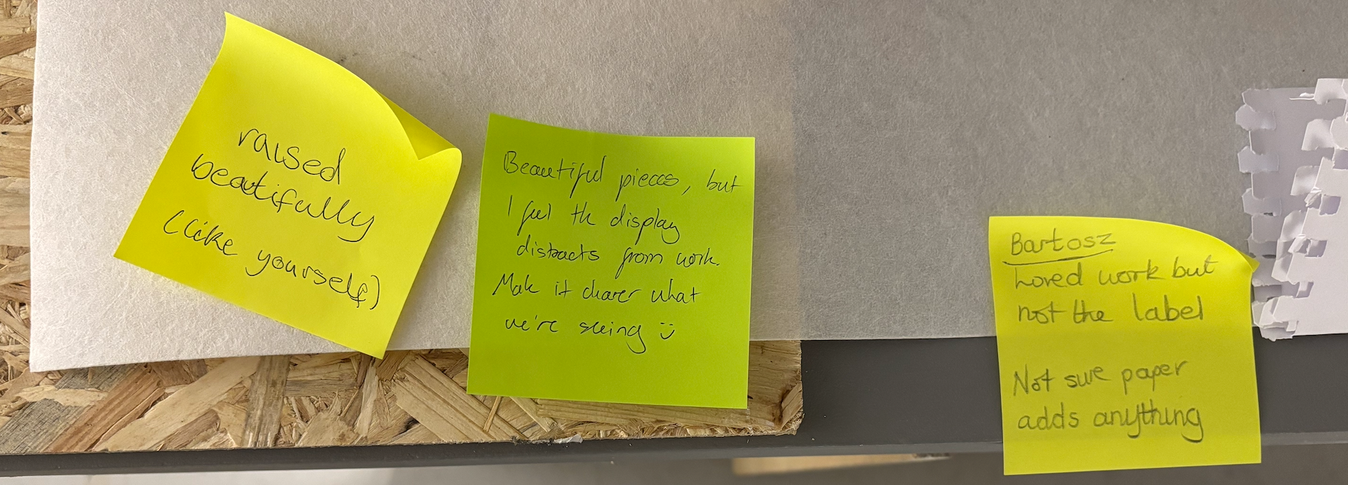
The circle patterns were also used in our curatorial exhibition to visualise how the pieces would be presented if they were placed on a sublimation printed fabric.
The issue was that the printed circle should be on a white background as the black takes away from the pieces. I did like the staggered plinth idea, however, having each piece at a different height.
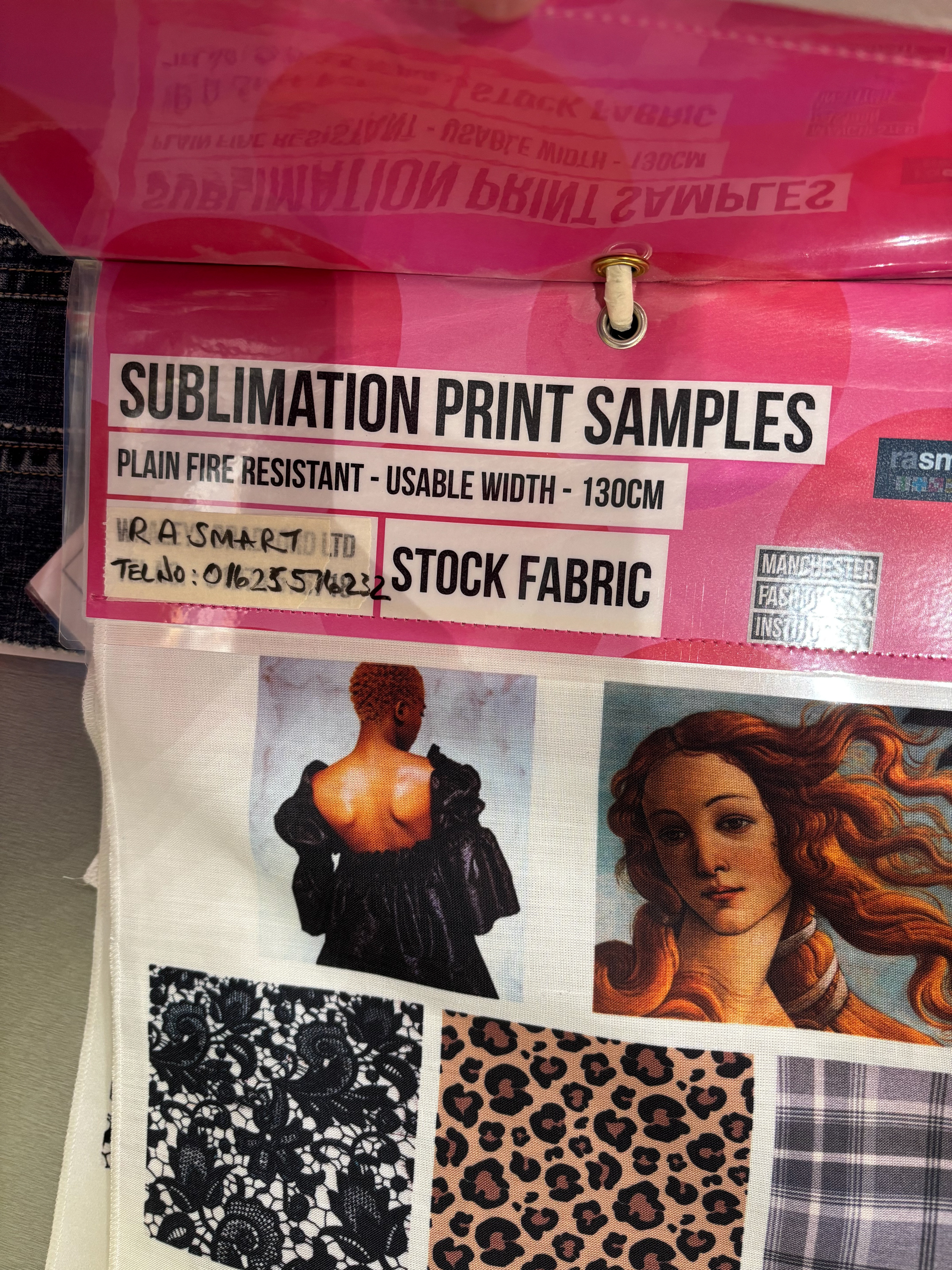
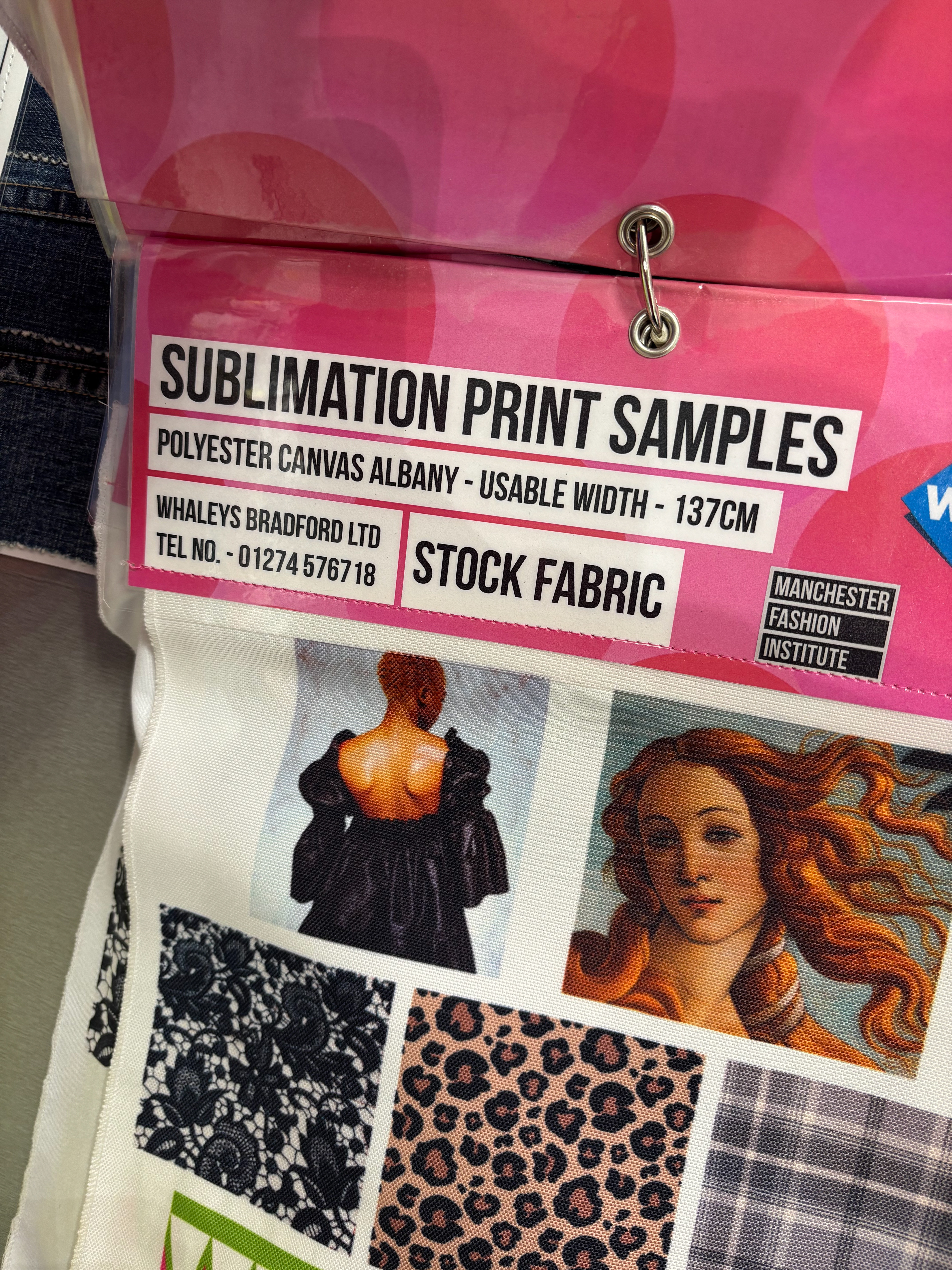
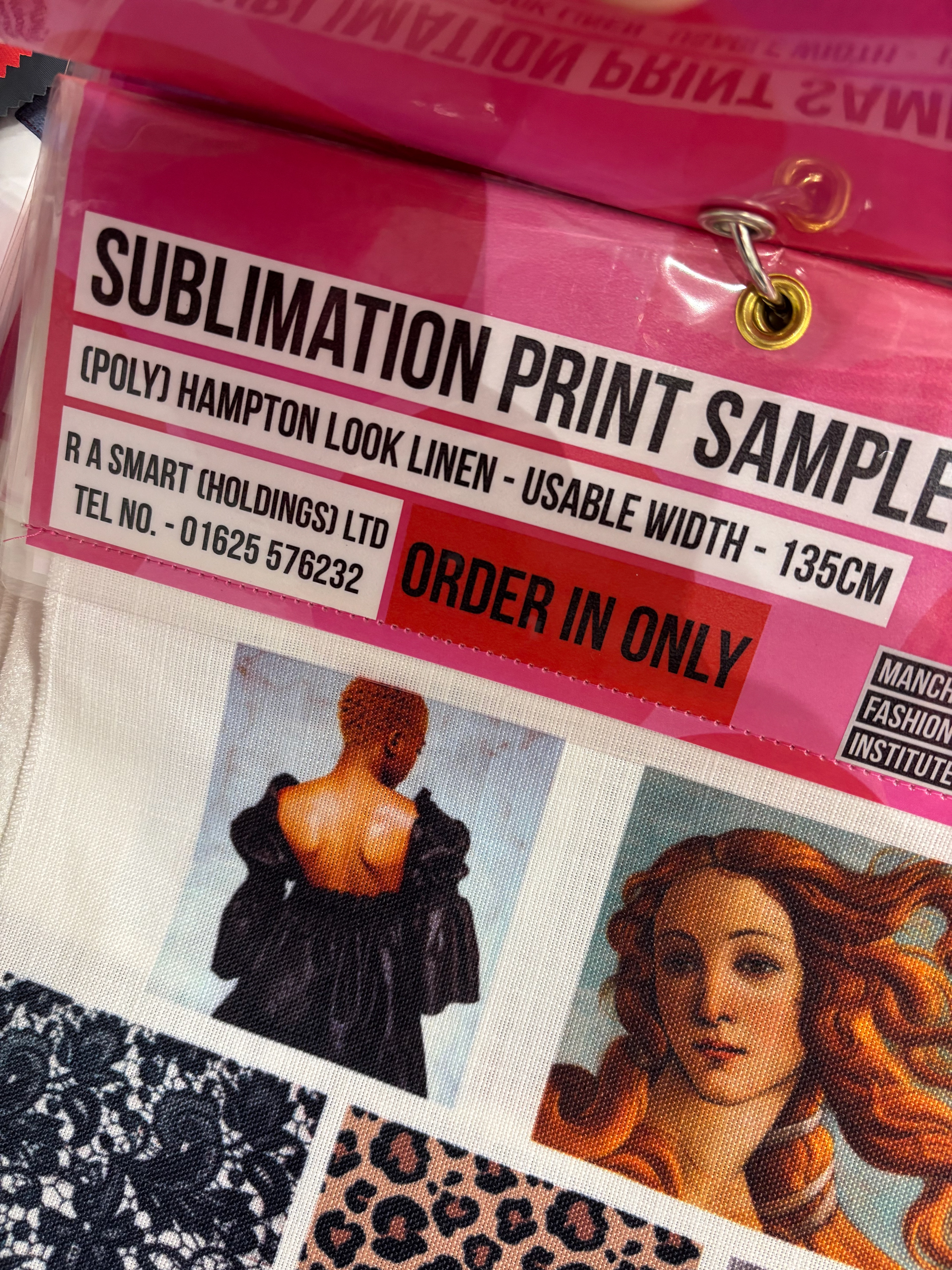
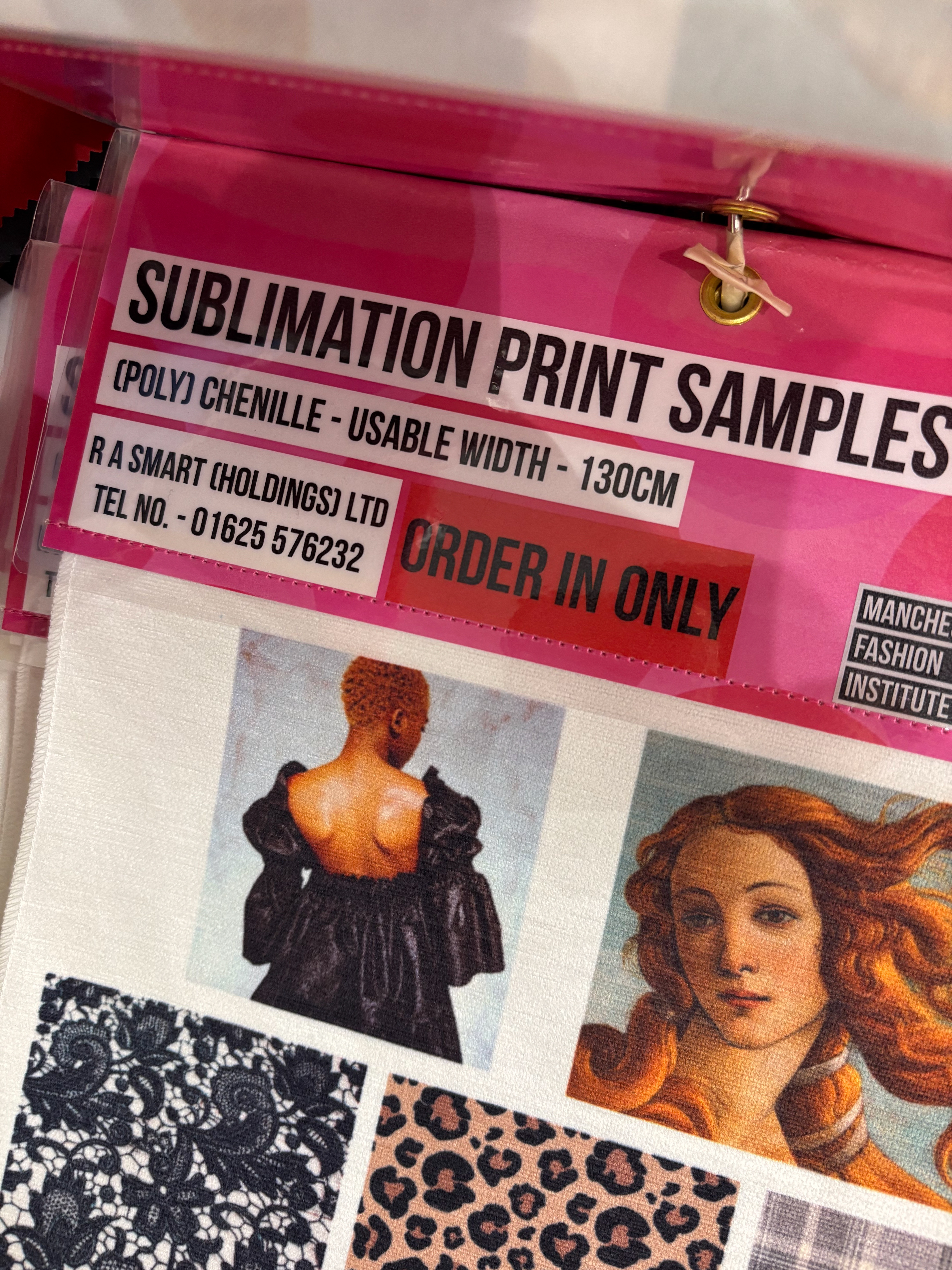
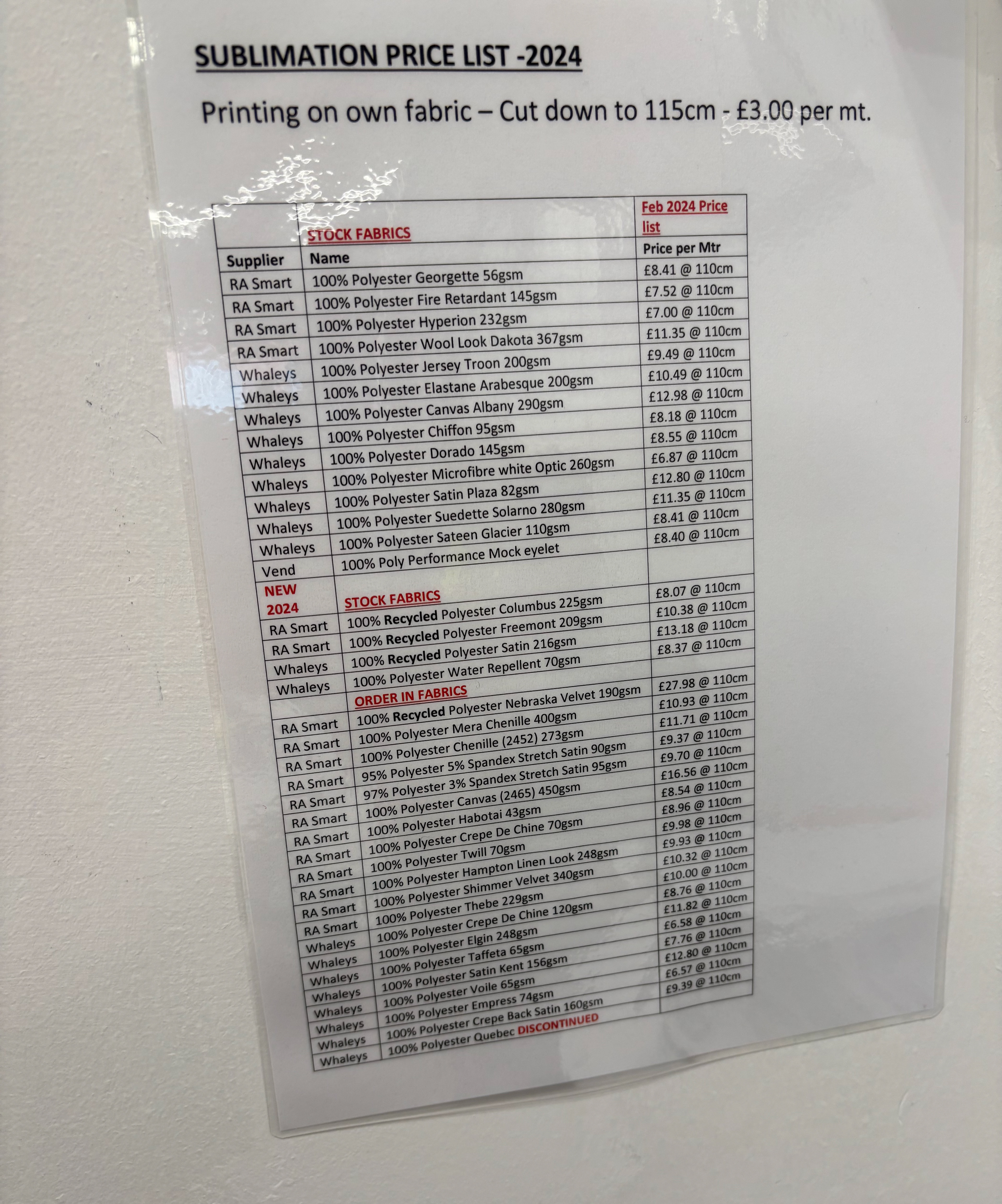
I looked into pricing of the fabric that I could sublimation print as shown below. Unfortunately, I felt like the samples were all not in line with the ancient aesthetic I was going for.
The further revelations of this mini exhibition was that I have to remove the archival book from my project. It wouldn't work thematically since it would add too much context the objects that a re meant to be excluded from a system, having virtually no context ton them apart from my 'interpretation'. The tutors agreed with this decision.
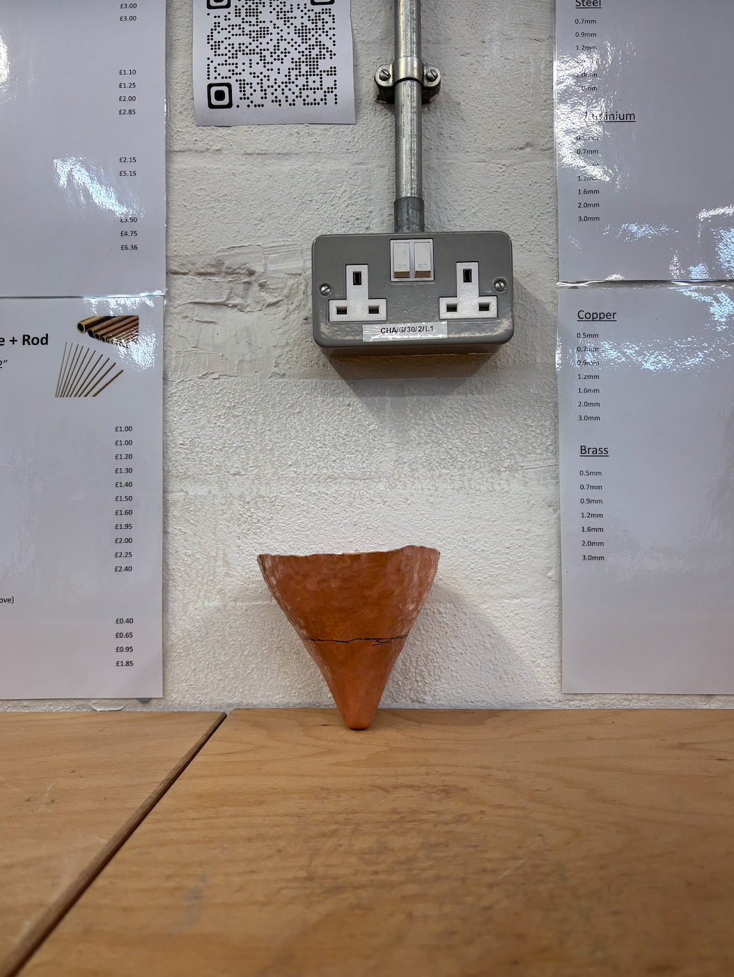
Quite late into the make, my rectangular vessel crashed at the base.
I enjoyed raising more isometric, straight edge shape so decided to redo it for my final collection and maintaining the harsh angles as a motif throughout the pieces.
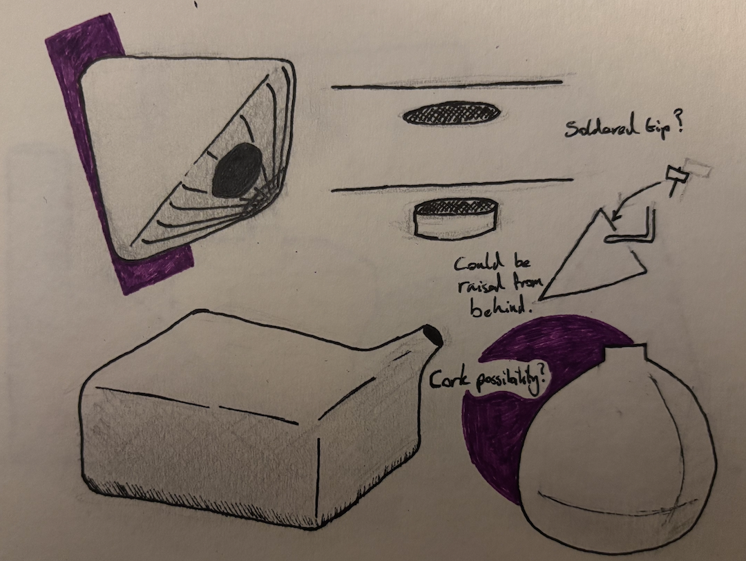
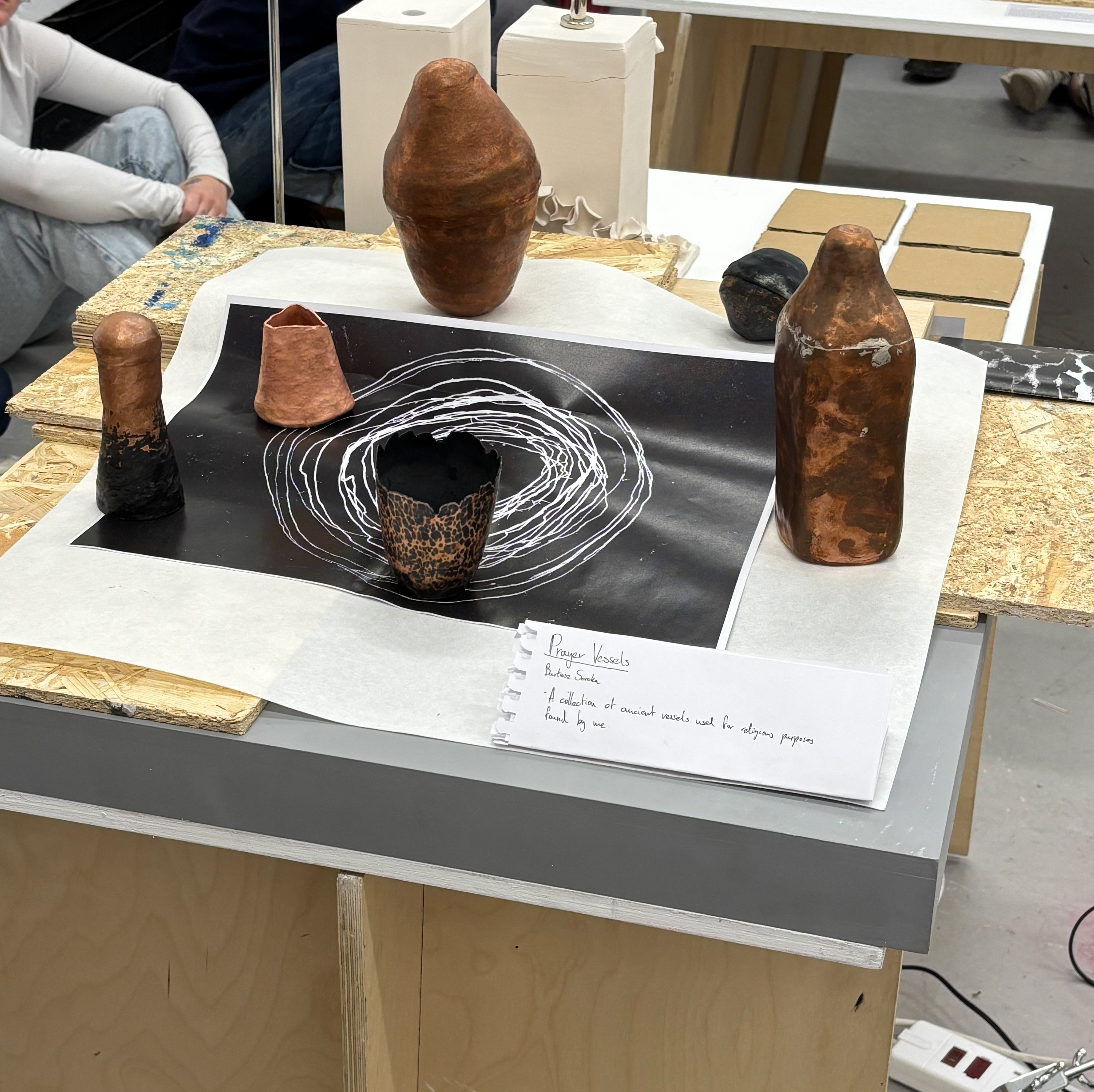
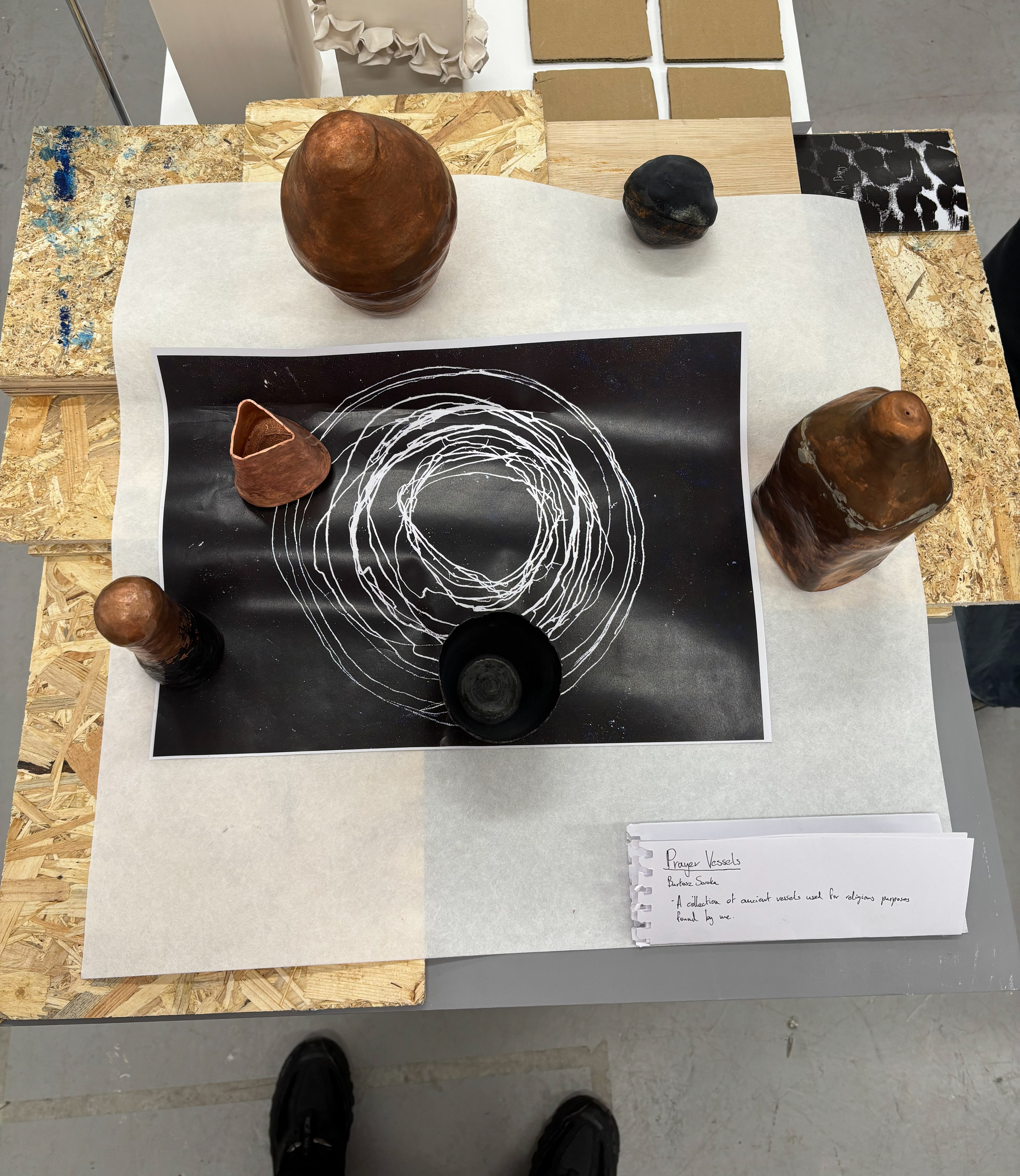
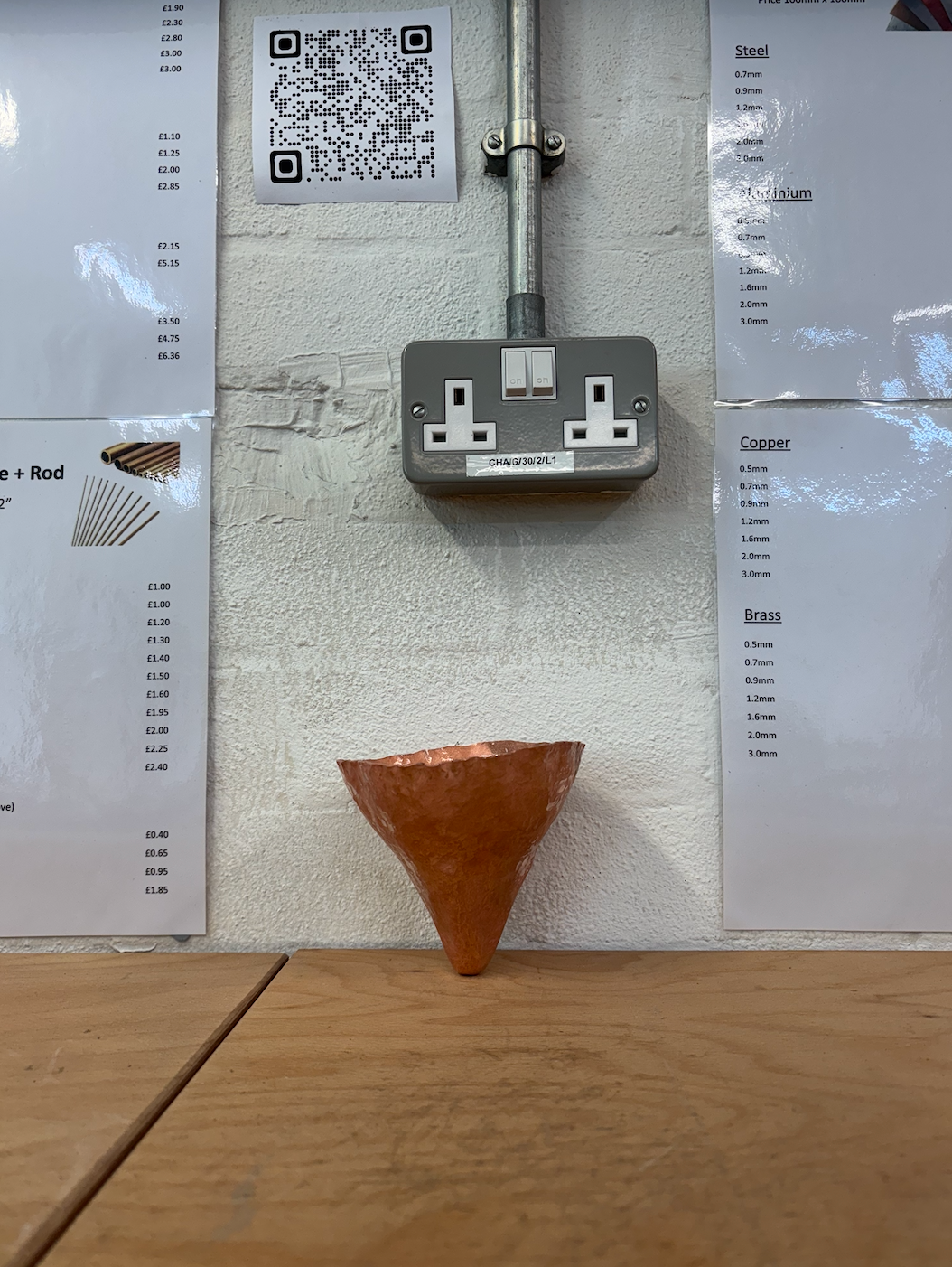
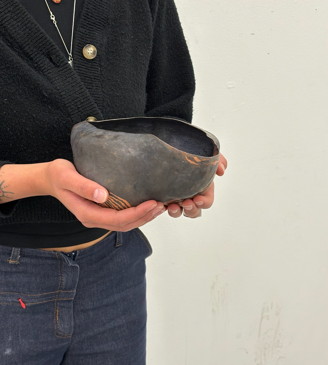
The first finished object I had, was this 'door knob' shape. When raising it I set my mind on having the vessels have very awkward bases, some vessels perhaps not even functioning when placed down. Environmental storytelling hinting at the vessels being meant to be held or carried when full. I decided that the purpose of them in my fictional presentation is that they're pouring vessels, meant to be held or poured and only placed down when empty.
I originally used pen to acid etch the design before applying a patina, but I didn't like the outcome of that so I strayed away from etching the other pieces.
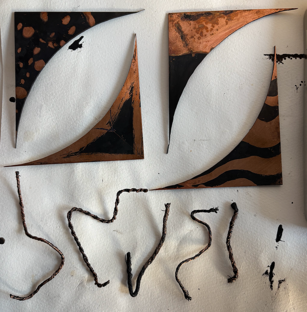
When making the second version of the triangular piece, the aim was to create an acute angled bowl first with a pointed base and add the edges in second, that being the flaw of my previous samples and why they broke.
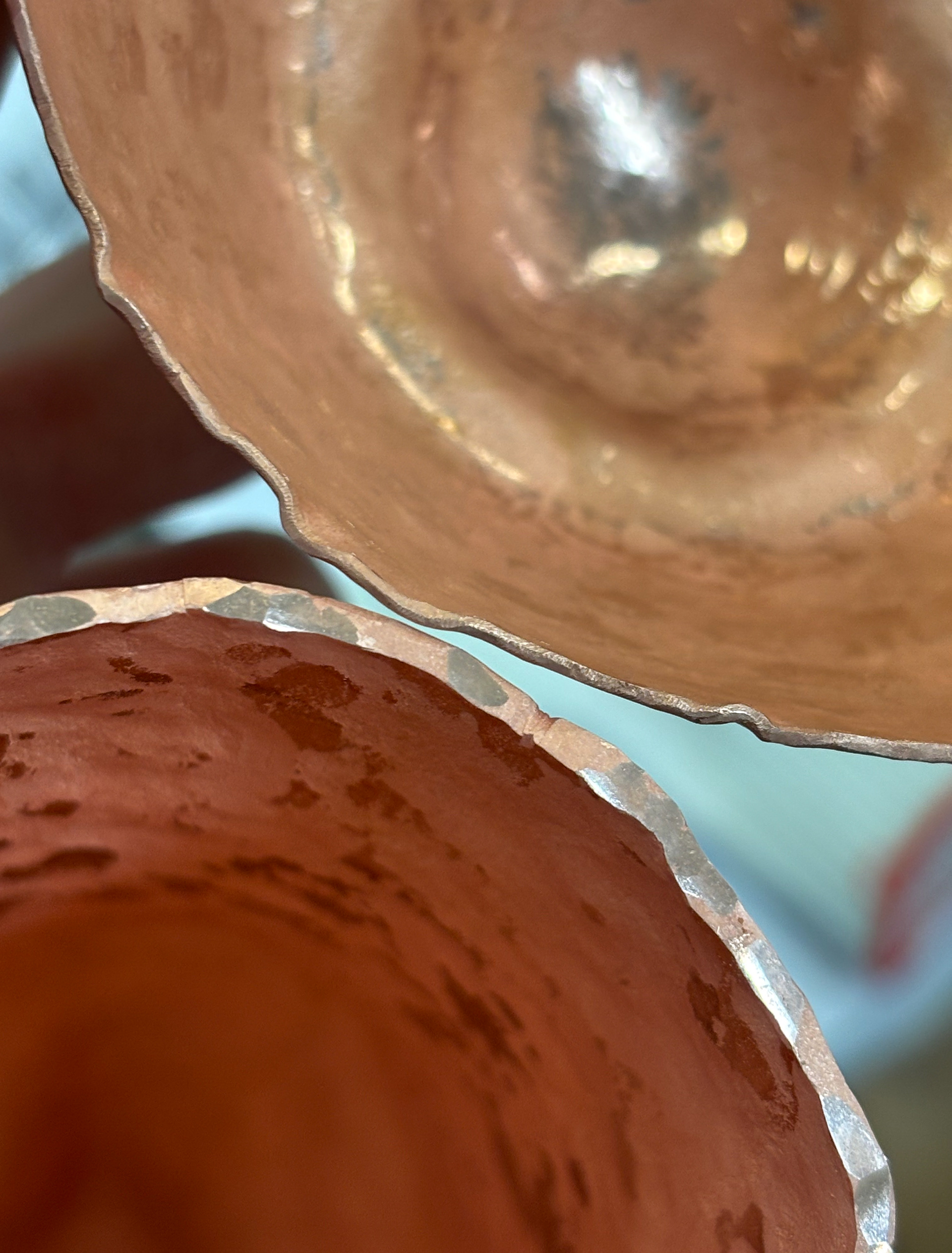
Raising in this way also protected the edges from cracking. I reinforced the edges of my piece with caulking, also. On the left is a comparison of a vessel at the start, with a 1.2 mm thickness and the piece towards the last rounds of raising, with the edge thickening to about 2.1 mm.
During this time, I began work on the second rectangular vessel, in this iteration it would be more square at the opening and have no base, allowing it to only be placed on its side. I also raised my largest 'pouring vessel', this one having 3 bases ,a looping it to stand and having an opening where the liquid is poured from. Having some vessels unable to stand and some with the ability suggests to me that they're just not meant to be placed when full.
This make was driven by process, there was no sketches and no circle documentation with the largest vessel, I was just developing the story as it went along.
You can see in the raising circles, how much less forceful it was to give sharp angles to the piece. Natural wear is successfully depicted through the corners getting more blunt at the opening of the vessel.
Since the original rectangular vessel broke and I had to redo it, I began to feel like raising these pieces was Sisyphean in nature. I wanted the rectangular vessel to reflect that. No matter how much you try to fill the container, the contents will always flow out when not held. Therefore, the second iteration has a curved base.
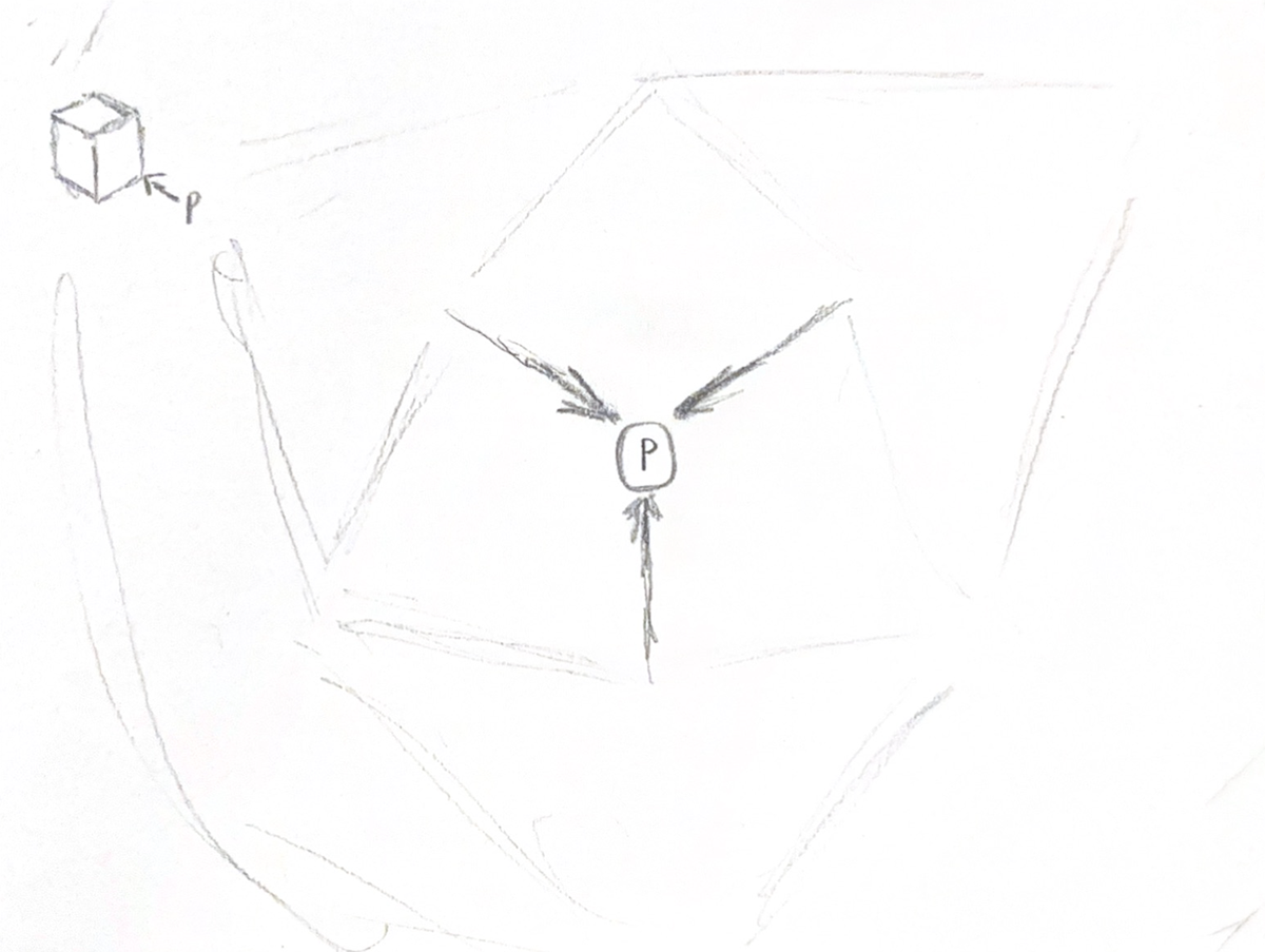
Based on my newly gained knowledge about the items, I painted the sealing liquid where I assumed the objects would be held.
When finalising the last three vessels, I regretted finishing the first piece so early - it was too polished. As I got deeper into the narrative I was creating I wanted the vessels to be more rough. Still pleasant to hold, but imperfect. Combining my research on sloppy craft with the idea of suspending an audience in disbelief, I decided to see how much I can get away with as long as I justify it.
Therefore, two of the following vessels have a completely flat opening, as if to suggest that it has been warn off by purposeful scrubbing. In my context film, this is referenced where a stone is being grated in circles against the rock floor. Some of this worked, like the leftover hammer marks, but the sanding was too much, it wasn't as fine as on the larger vessel.
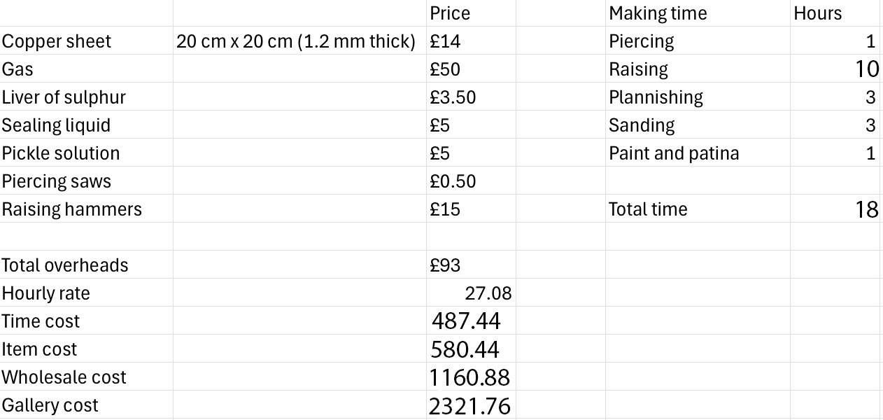
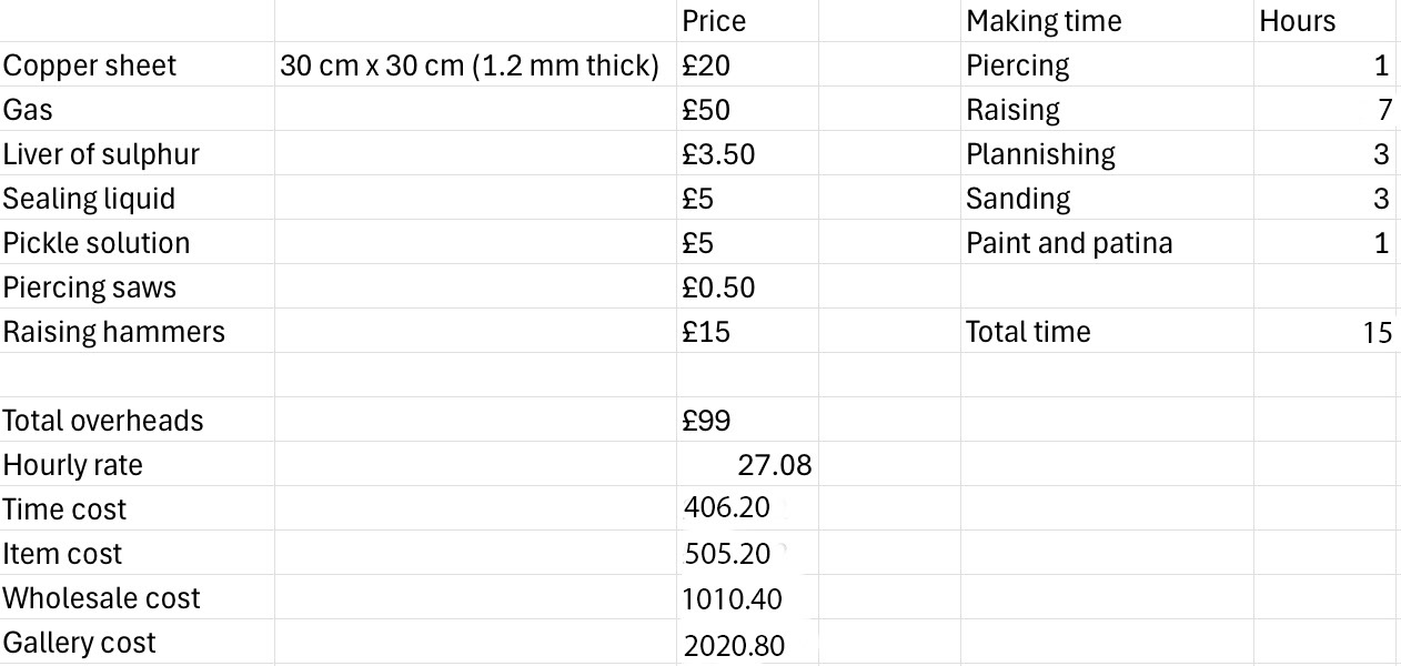
I estimated costs based on the information provided and worked out the costs of the small vessels (left) and the larger piece (right).